
Before this: How to Login to the Application?
How to Use the Dashboard?
Control Panel is the main screen that opens after logging in; From here you see your subscription/credit/event summary, go to all sections of the application with the left menu, launch the cabin and log out.
- You must be logged in to the application — Control Panel is only visible while logged in
- Internet connection is recommended to keep metrics (AI Credits, subscription) up to date — if there is no connection, values may remain '—' or old
step by step
Step 1 · Control Panel overview
Dashboard
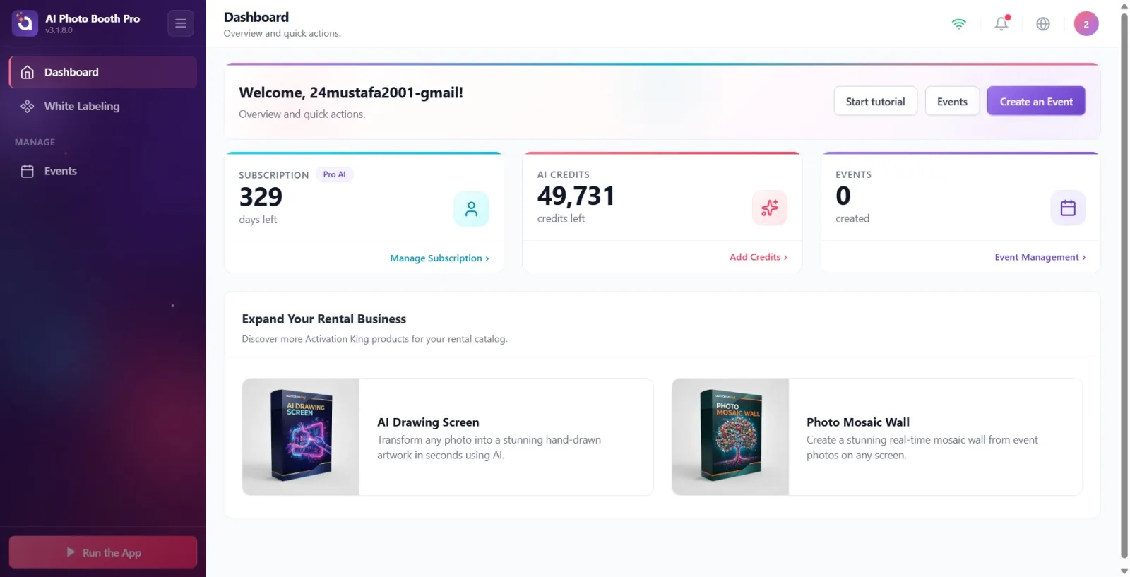
After logging in, the Control Panel opens directly (main screen). At the top is the welcome banner, below it are the information banners (trial/update), then the three metrics cards (Subscription, AI Credits, Event), and at the bottom is the product section Expand Your Rental Business. On the left is the sidebar (menu), and at the top is a top bar (WiFi status, notifications, language, user menu).
🔎 On-screen elements: Welcome banner + 3 metrics cards + product section; sidebar on the left, top bar on the top
Step 2 · First-time entry: the "No Events Yet" welcome window
Dashboard → Welcome Window
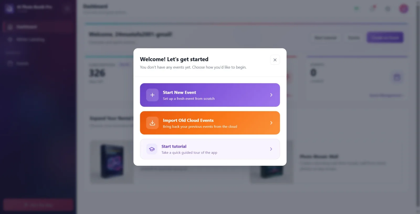
If the device has no events at all (a fresh install / new user), a welcome modal automatically appears over the Dashboard as soon as it opens, with the heading Welcome! Let's get started and the subtitle You don't have any events yet. Choose how you'd like to begin. Below it are three option cards: the purple Start New Event (Set up a fresh event from scratch — opens the creation wizard from Document 09 directly), the orange Import Old Cloud Events (Bring back your previous events from the cloud — opens the cloud-import window), and the light-purple Launch Tutorial (Take a quick guided tour of the app — starts the guided walkthrough). The modal can be closed with the X in the top right or by clicking outside it; once closed, the empty Dashboard is shown, and the same three options remain reachable afterward through the normal paths (the welcome banner buttons from Step 1, the left menu).
🔎 On-screen elements: modal heading Welcome! Let's get started + subtitle; three cards: Start New Event (purple) / Import Old Cloud Events (orange) / Launch Tutorial (light purple); close (X) in the top right
Step 3 · Welcome banner and quick action buttons
Dashboard
The top banner welcomes you with the title Welcome ('Welcome, {name}!' if your name is registered); It says Overview and quick actions. under it. There are three buttons on the right: 'Launch Tutorial' (starts the guided demo tour), 'Event' (opens the Event Management screen) and the purple 'Create an Event' button (directly opens the new event creation flow).
🔎 Elements on the screen: Welcome title + 'Launch tutorial' | 'Event' | 'Create an Event' buttons
Step 4 · Information banners: Trial and Update
Dashboard
There may be two conditional banners under the welcome banner. If you have a trial period, the 'Free Trial — {days} remaining' banner will appear; The Get Full Access button opens the subscription purchase screen. If there is a new version of the app, an 'Update Available — {version}' banner appears; Tapping the banner or the View Update button shows the release notes. These banners appear only when the relevant condition is met (they will not appear if there are no trial days left or there are no updates).
🔎 On-screen elements: 'Free Trial … days left' banner + Get Full Access; Update Available banner + View Update
Step 5 · Metric cards: Subscription, AI Credit, Event
Dashboard
Three summary cards show your status. Subscription card: plan badge (e.g. Trial/Pro/Ultimate) + days left with number of days remaining, Manage Subscription link below (opens subscription/purchase screen). AI Credits card: remaining credit + credits left, below which is the Add Credits link (opens the credit purchase screen). Event card: number of events you created + created, below which is the link to Event Management (opens the Events screen). The AI Credit value appears as '—' until it arrives from the server.
🔎 Items on the screen: Subscription + Manage Subscription | AI Credits + Add Credits | Event + Event Management

Step 6 · Expand Your Rental Business product section
Dashboard
The Expand Your Rental Business section at the bottom of the page (with the description 'Discover more Activation King products for your rental catalogue.') introduces additional Activation King products (e.g. 'AI Drawing Screen', 'Photo Mosaic Wall'). Tapping a product card does not open a feature within the app; It opens the relevant product promotion page (activationking.com) in the device's browser.
🔎 On-screen elements: Expand Your Rental Business title + product cards ('AI Drawing Screen', 'Photo Mosaic Wall')
Step 7 · Navigating via sidebar (left menu)
Dashboard
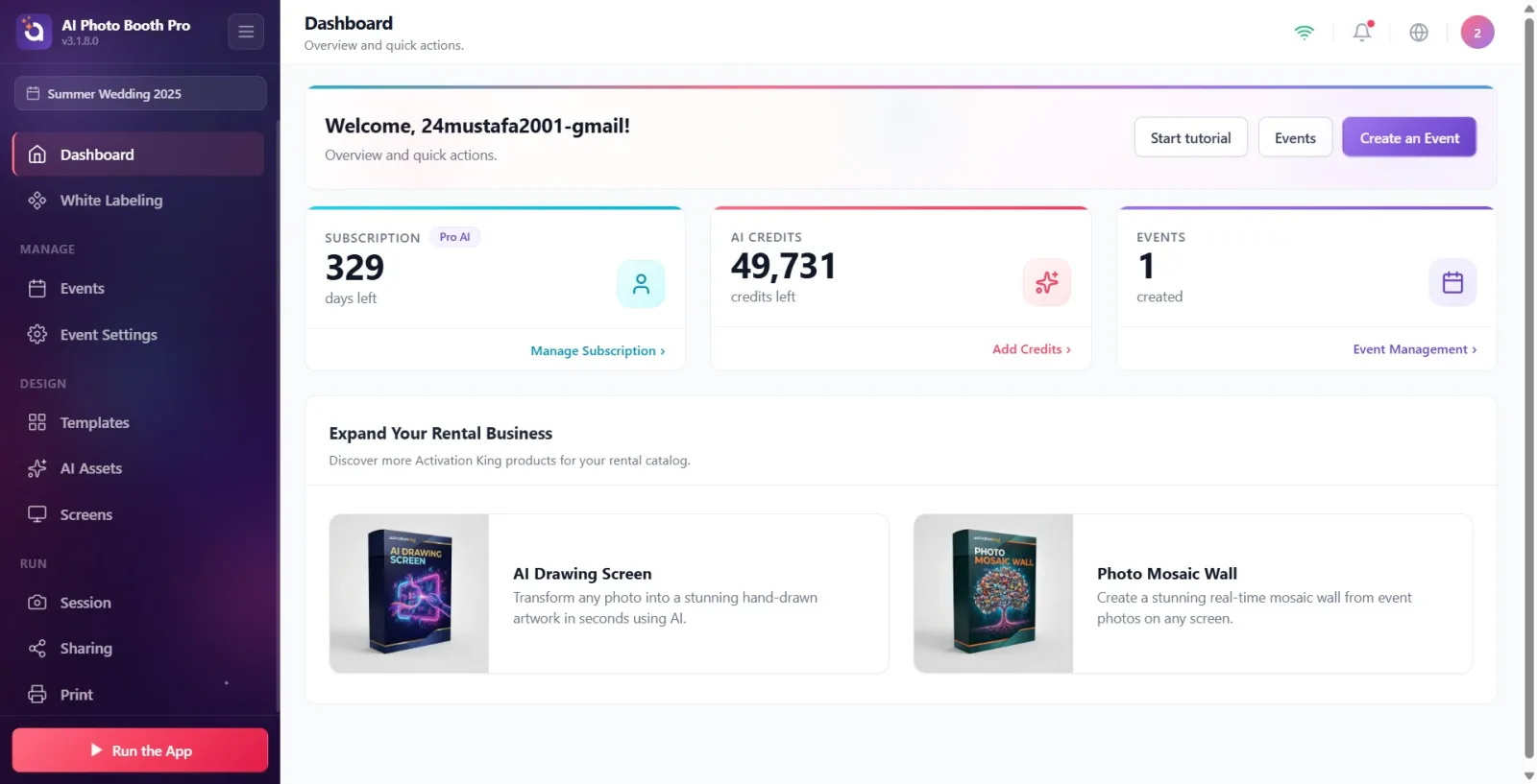
The left sidebar provides access to all sections. At the top are the ungrouped Dashboard (and White Labeling if you have authorization), then the grouped tabs: Manage group (Events, Event Settings), Design group (Templates, Screen Design, AI Assets), Run group (Session, Sharing, Print). When you select an event, a label appears at the top of the sidebar showing the name of that event. On desktop/tablet, the menu remains fixed; on mobile, it comes as a panel that slides in from the left (opened by the menu/arrow icon at the top).
🔎 Elements on the screen: Sidebar groups: Manage | Design | Run; active event name label at top; collapse menu button in bottom corner
Step 8 · Tabs linked to the activity — hidden unless the activity is selected
Dashboard
When no events are selected, only Dashboard, Events (and White Labeling if authorized) appear in the sidebar. The Event Settings, Templates, Screen Design, AI Assets, Session, Sharing, and Print tabs are not shown at all until an event is selected — this is not a bug, but intentional behavior. To see these tabs, first create an event or select an event from the Events screen; Once the selection is made, the relevant tabs appear automatically.
🔎 Items on the screen: Incognito tabs without event selection: Event Settings, Templates, Screen Design, AI Assets, Session, Sharing, Print
Step 9 · Top bar: connection status, notifications, language and user menu
Dashboard
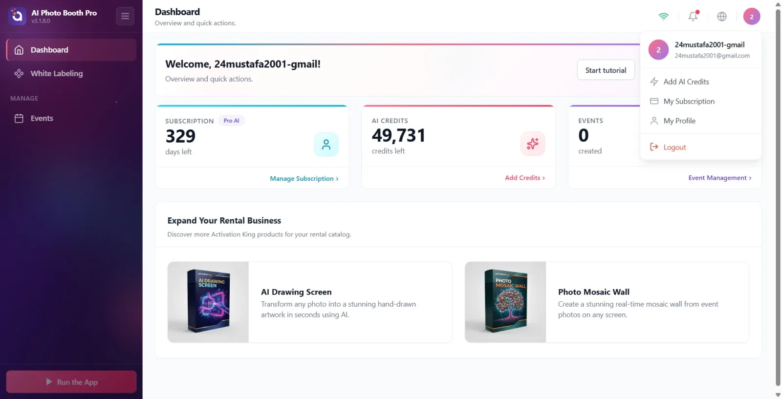
In the top bar at the top right: WiFi icon shows online/offline status (Connected / No Internet); the bell icon opens the Notifications list (red dot appears if unread); the globe icon opens the language selector (11 languages including Turkish); The rightmost initial badge (avatar) opens the user menu. The user menu has Add AI Credits, My Subscription, My Profile and Logout at the bottom.
🔎 Items on the screen: WiFi status | Notifications | language selector | avatar → user menu (Add AI Credits, My Subscription, My Profile, Logout)
Step 10 · Run the App — start cabinet/session
Dashboard → Run the App
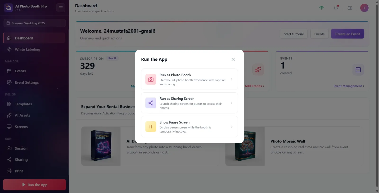
The Run the App button with the play (triangle) icon at the bottom of the sidebar (floating play button at the bottom right on mobile) opens the cabinet launch window. This button is only active when an event is selected — when the event is not selected, it is dimmed/inactive and does not pop up. The window that opens has three options: Run as Photo Booth ('Launch the full photo booth experience with capture and sharing.'), 'Run as Share Screen' ('Launch the share screen where guests can access their photos.') and 'Show Standby Screen' ('Display the standby screen when the booth is temporarily unused.'). Tapping an option exits the Control Panel and switches to the selected operating mode.
🔎 Items on the screen: Run the App button (inactive if there is no activity) → Run as Photo Booth in the window | Run as Sharing Screen | Show Pause Screen
Step 11 · Logout
Dashboard
To log out, tap the avatar badge in the top right and tap the red Logout option at the bottom of the user menu that opens. Are you sure you want to log out? confirmation window appears; With Yes the logout is completed (you return to the login screen), with No you cancel.
🔎 Items on the screen: User menu → Logout → confirmation window Are you sure you want to log out? (Yes / No)
It is normal that some tabs do not appear in the left menu: Event Settings, Templates, Screen Design, AI Assets, Session, Sharing and Print appear only when an event is selected.
The Run the App button is inactive (dimmed) without selecting an event — create or select an event first.
If you see '—' on the AI Credit card, the value has not yet been loaded from the server (internet required); When loaded, the real number comes.
Subscription and credit information syncs with the server in the background each time the Control Panel is opened — post-purchase values are updated shortly.
The activity name label at the top of the sidebar indicates which activity you are currently configuring; To avoid trading in the wrong tab, look here.
Trial and update banners are conditional: they will not appear at all if there are no trial days left or if there is no new version.
The "No Events Yet" welcome modal only appears when the device genuinely has zero events (typically on first setup); there's no way to bring it back deliberately afterward — the same three actions (new event, import from cloud, tutorial) are always reachable from the welcome banner and the left menu as well.
Mistaking missing tabs for error — Event Settings/Templates/Screen Design/AI Assets/Session/Sharing/Print is intentionally hidden without selecting the event.
Pressing the Run the App button and getting no response — the button only works when the event is selected; When passive, the window does not open.
Thinking the credit is zero when the AI Credit is '—' — this is just a 'not loaded yet' indicator.
Mistaking product cards (AI Drawing Screen, Photo Mosaic Wall) for an in-app feature — they redirect to an external promotional site (activationking.com).
The Manage Subscription / Add Credits links on metrics cards are mistaken for informational information — they open the purchase / subscription screen.
Thinking you skipped the confirmation window when logging out — Logout asks for Are you sure you want to log out? confirmation first; The exit is not completed without saying Yes.
Related topics
Creating an Event Event Management (Events) Event Settings → Main Run the Application (Session)