
Before this: How to Create an Event?
Screen Design (appears as Screen Design in the app) is the Design section, where you customize the appearance of the booth screens — colors, theme, logo, backgrounds, and opacity — and consists of 8 tabs. The first tab, General, allows you to manage global appearance settings common to all booth screens (colors/theme, logo, background, dashboard icon, screen-based custom backgrounds, and opacity) in one place; changes are saved automatically, without a separate save button, and appear instantly with a live preview.
- An event must be created and selected (active) — Screen Design in the left menu is only accessible when an event is selected
- You must have access to the settings screen and the Design group
Step by step
Step 1 · Open the Screen Design page
Settings → Design
In the Settings left menu, tap Screen Design under the Design group (with on-screen icon). When the page is opened, Screen Design appears as the title at the top, and Design your guest experience. appears below it. Note: This item is only accessible when an event is selected; If the event is not selected, it will not be active in the menu.
🔎 Items on the screen: Left menu Design group → Screen Design item; page title Screen Design, subtitle Design your guest experience.
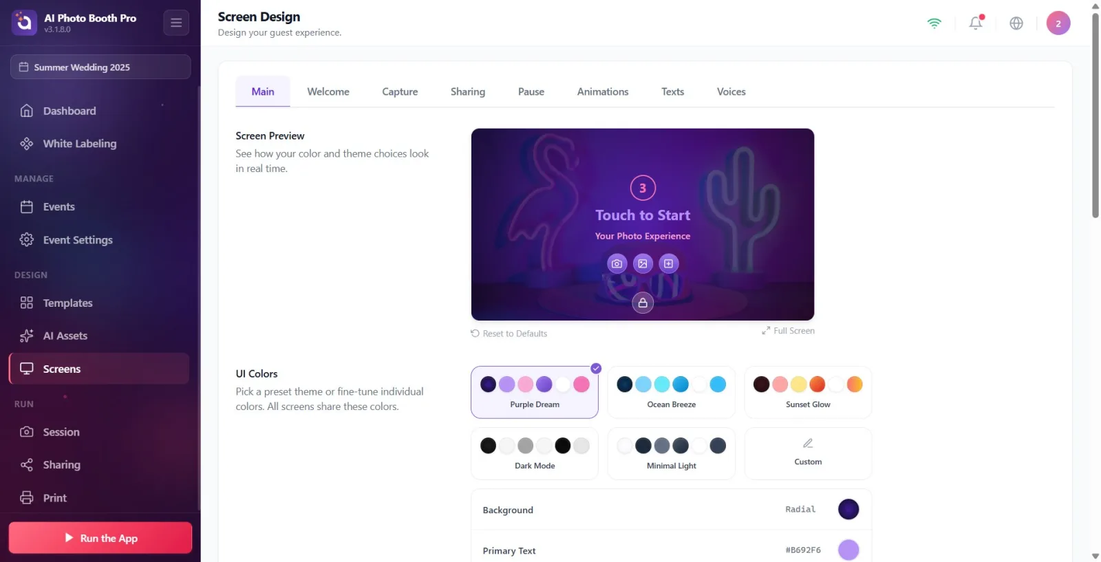
Step 2 · Tab structure overview
Screen Design
There is a bar with 8 tabs at the top of the page. Respectively: General, Welcome, Capture, Sharing, Pause, Animations, Texts and Voices. Each tab customizes a different part of the booth experience. When the page is first opened, the General tab appears by default; The tab you selected is remembered, and the last tab you opened will be shown the next time you open it.
🔎 Elements on the screen: Tab bar: General | Welcome | Capture | Sharing | Pause | Animations | Texts | Voices (active tab hover)

Step 3 · Understand the scope of the General tab
Screen Design → General
The General tab contains appearance settings common to all booth screens. From top to bottom, the sections are: Screen Preview, UI Colors, Default Logo, Default Background, Dashboard Icon, Custom Backgrounds, and Backgrounds Opacities. Every change in these sections is automatically saved and instantly reflected in the live preview at the top.
🔎 Items on the screen: Section titles: Screen Preview, UI Colors, Default Logo, Default Background, Dashboard Icon, Custom Backgrounds, Backgrounds Opacities
Step 4 · Use the Screen Preview section
Screen Design → General
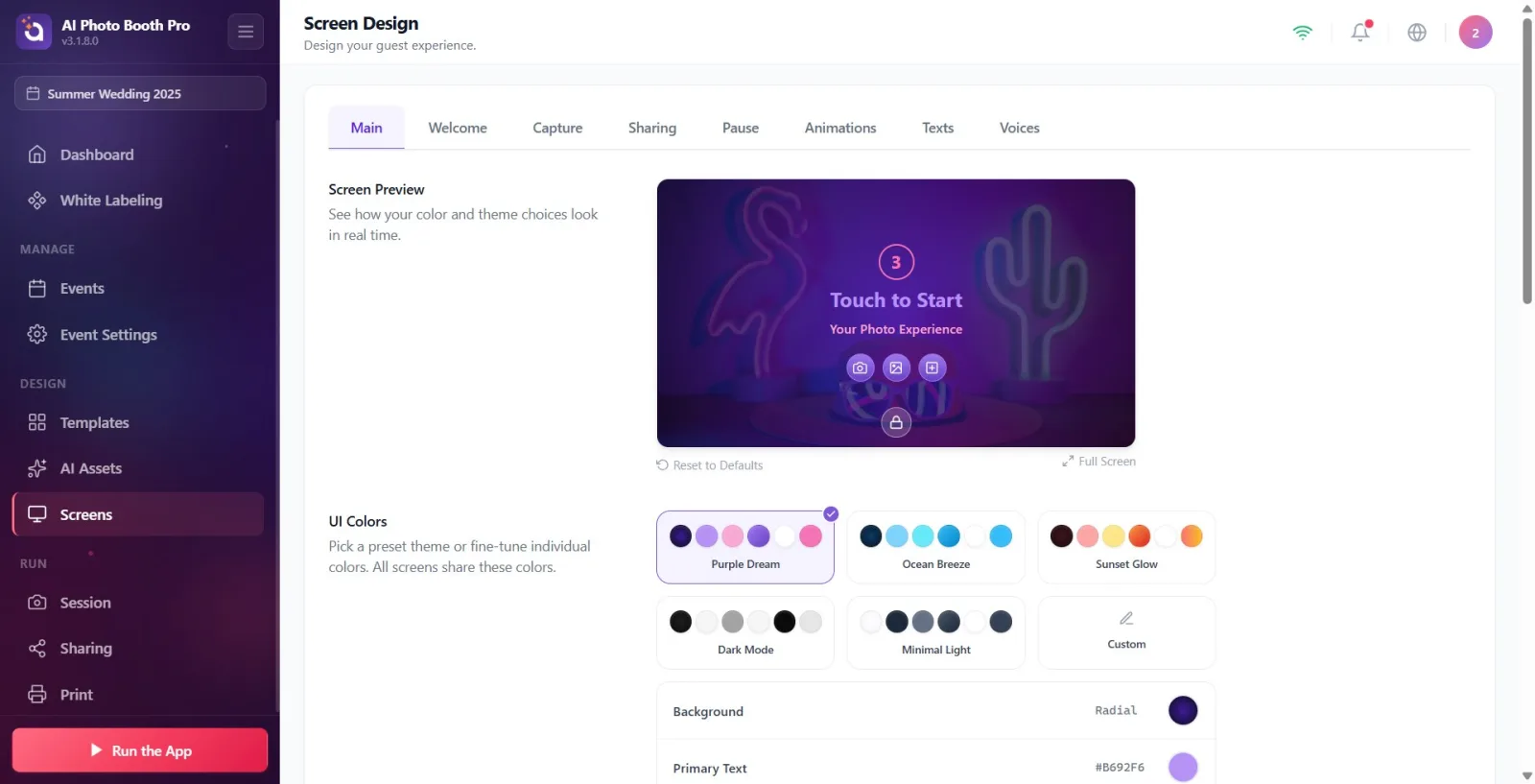
At the top of the tab is the Screen Preview section (description: See how your color and theme choices look in real time.). This card shows your chosen colors, theme, background, logo, and dashboard icon in real time. There are two actions at the bottom of the card: Reset to Defaults (link) and Full Screen (button). Full Screen opens the preview in large size; Tap the close (X) icon in the corner to close it.
🔎 On-screen elements: Screen Preview title + preview card; sub-actions: Reset to Defaults link and Full Screen button
Step 5 · UI Colors — select ready theme
Screen Design → General
In the UI Colors section (description: 'Choose a preset theme or set colors individually. All displays share these colors.') there are six preset theme cards: 'Purple Dream' (default), 'Ocean Breeze', 'Sunset', 'Dark Mode', 'Minimal Light' and 'Custom'. Tapping a theme replaces all six colors with that theme's palette. Custom just marks the card as Custom without touching your existing colors.
🔎 On-screen elements: Theme cards: Purple Dream | Ocean Breeze | Sunset Glow | Dark Mode | Minimal Light | Custom (selected card highlighted)
Step 6 · UI Colors — adjust colors one by one
Screen Design → General
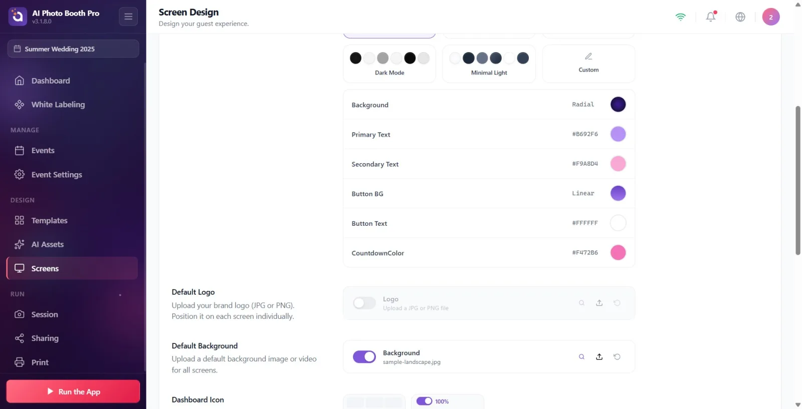
Below the theme cards are six color rows: Background, Main Text, Secondary Text, Button BG, Button Text, and the countdown color (this row appears as the label 'CountdownColor' for lack of translation — it sets the color of the countdown number). Tapping the color box in a row opens the color picker; You can choose solid color or gradient. The color you choose is instantly saved and reflected in the preview. These colors are common to all booth displays.
🔎 Elements on the screen: Color rows: Background, Main Text, Secondary Text, Button BG, Button Text, 'CountdownColor' (countdown color); color value label + color box in each row
Step 7 · Install Default Logo (default off)
Screen Design → General
In the Default Logo section (description: Upload your brand logo (JPG or PNG). Position it on each screen individually.) there is a file selector line titled Logo (Upload a JPG or PNG file). This section has an on/off switch and is OFF by default — just turn it on and upload an image for your logo to appear. Only image files are accepted. You can use the restore button to return the file you uploaded to default.
🔎 Elements on the screen: Default Logo title; Logo file selector (description Upload a JPG or PNG file), toggle switch (default off), restore button — image only
Step 8 · Set Default Background (default on)
Screen Design → General
In the Default Background section (description: Upload a default background image or video for all screens.) there is a file selector titled Background (Upload a JPG, PNG or MP4 file). This switch is ON by default and shows a sample background photo on startup. You can upload images or videos. If you turn off the switch, no background will be displayed, only the color/gradient.
🔎 Elements on the screen: Default Background title; Background file selector (description Upload a JPG, PNG or MP4 file), on/off switch (default on), restore button — image or video
Step 9 · Set the location and visibility of Dashboard Icon
Screen Design → General
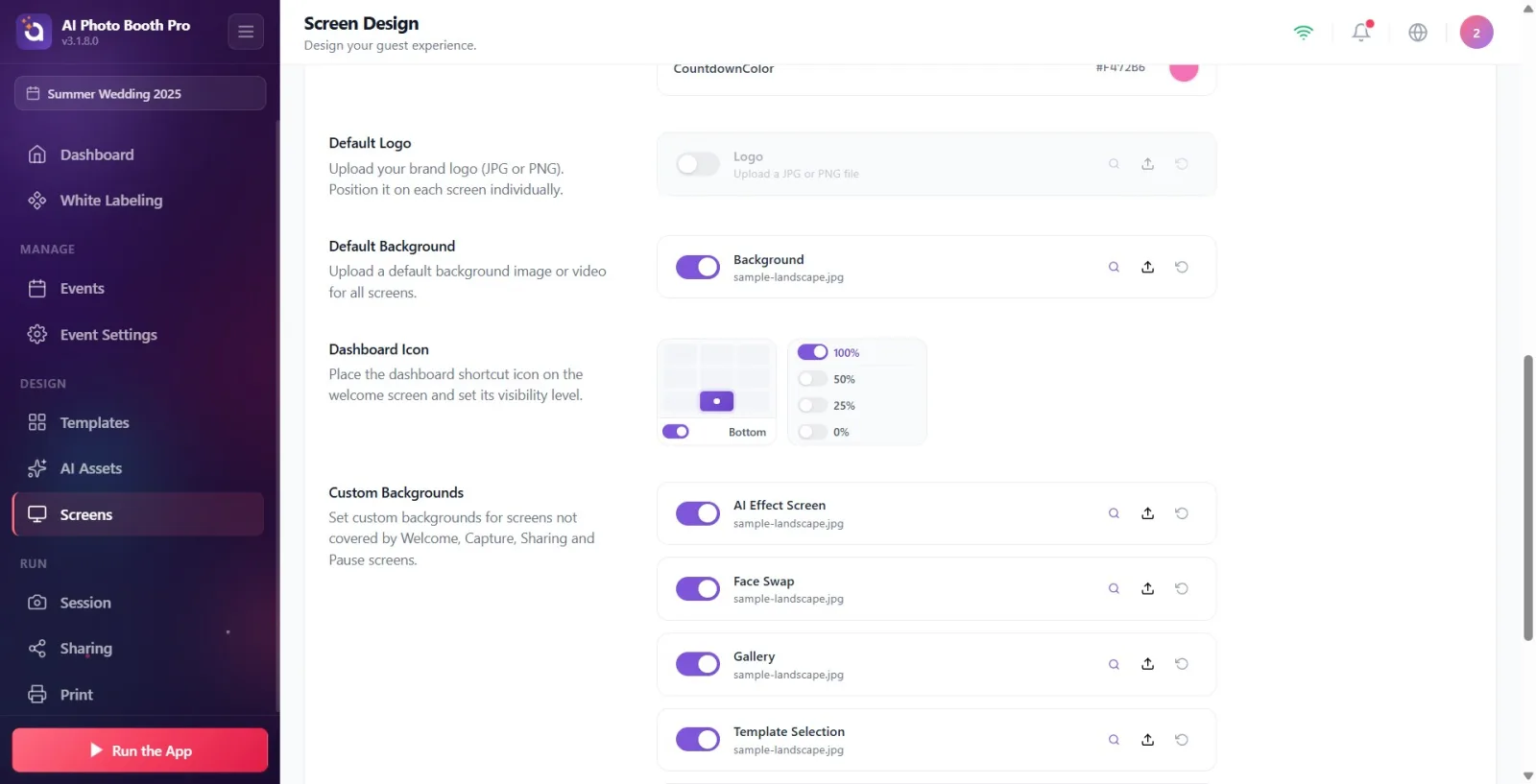
The Dashboard Icon section (description: 'Place the admin panel shortcut icon on the welcome screen and adjust its visibility level.') contains two controls: a position grid and an opacity selector. You place the icon by tapping a cell in the grid, and you remove it by tapping the same cell again. The Opacity option takes values of '100%', '50%', '25%' or '0%' (0% hides the icon completely). This is a shortcut for quick access to the administration panel from the operator's welcome screen.
🔎 On-screen elements: Position grid (tap-to-place cell / tap-to-remove) + opacity selector: '100%' | '50%' | '25%' | '0%'
Step 10 · Give screen-based background with Custom Backgrounds
Screen Design → General
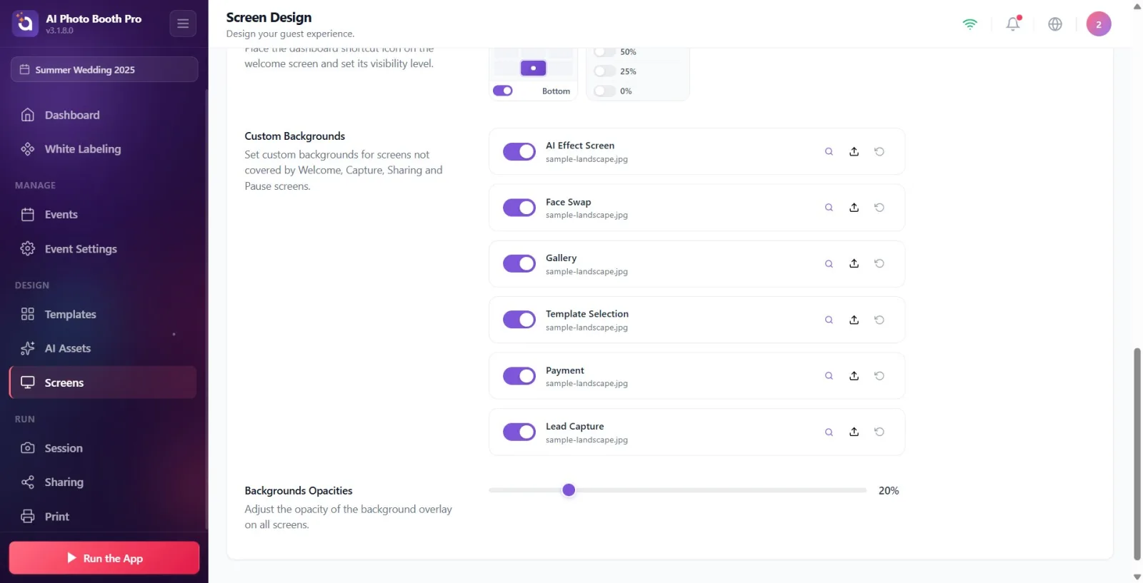
The Custom Backgrounds section (description: Set custom backgrounds for screens not covered by Welcome, Capture, Sharing and Pause screens.) allows you to define separate backgrounds for six separate screens: AI Effect Screen, Face Swap, Gallery, Template Selection, the payment screen ('Payment' appears due to lack of translation in the tag), and Lead Capture. Each row has its own on/off switch and is on by default; If you turn off the background of a screen, that screen automatically turns to Default Background. Each line accepts images or video.
🔎 Items on the screen: File selector lines: AI Effect Screen, Face Swap, Gallery, Template Selection, 'Payment', Lead Capture — each toggle + restore, image/video
Step 11 Adjust background density with Backgrounds Opacities
Screen Design → General
The Backgrounds Opacities section (description: Adjust the opacity of the background overlay on all screens.) contains a slider and percentage value from 0 to 100. By moving the slider, you adjust how prominent the background will be (default 20%). If there is no active background (Default Background is off), the slider is disabled.
🔎 Elements on the screen: 0-100 slider + percentage value (e.g. '20%'); disabled when there is no background
Step 12 · Reset base view with Reset to Defaults
Screen Design → General
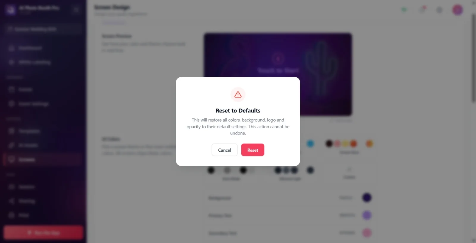
Tap the Reset to Defaults link at the bottom of the preview card. A confirmation alert pops up — title Reset to Defaults, message: 'This will restore all colors, background, logo and opacity to their default settings. This cannot be undone.' Tap 'Reset' to confirm or 'Cancel' to cancel. Reset; returns the theme to 'Purple Dream', the background to default (light + sample photo), the logo to off and the opacity to 20%. Note: Dashboard Icon and Custom Backgrounds are NOT affected by this reset.
🔎 Items on the screen: Reset to Defaults confirmation dialog: title Reset to Defaults, Reset (primary) and Cancel (secondary) buttons
Step 13 · Changes are saved automatically
Screen Design → General
There is no separate Save button. Color, theme, logo, background, dashboard icon, custom background and opacity changes are all automatically saved as soon as they are made and applied to all relevant booth screens. Live preview shows changes instantly.
Colors and theme are common to all booth displays ('All displays share these colours') — individual displays cannot be assigned individual colours; screen-based customization is done at the background level only with Custom Backgrounds.
Choosing a preset theme overwrites all six colors. To fine-tune, tap a theme, then tap the color line you want to change.
Default Logo is OFF by default; For your logo to appear, first turn on the switch and upload an image (only images are accepted).
Default Background is on by default and shows an example photo; If you turn it off, only the color/gradient remains.
The Backgrounds Opacities slider only works when there is an active background; Disabled when background is off (default 20%).
Closing a screen in Custom Backgroundsdoes not leave it completely blank — that screen returns to Default Background.
Your tab selection is remembered: The next time you open the Screens page, the last tab you left off will appear.
To see the changes larger, use the Full Screen button on the preview card; Tap the X in the corner to close it.
Thinking that Reset to Defaults resets everything — it just restores the colors, default background, logo, and opacity; Dashboard Icon and Custom Backgrounds are not affected.
Trying to get to the Screen Design page without selecting an activity — the item in the left menu is only accessible when an activity is selected.
Complaining about the logo not appearing — Default Logo is off by default; You need to turn on the switch first.
Turning off the background and being surprised that the opacity slider doesn't work — when there is no background the slider is disabled.
Expecting different text/button colors for each screen — colors are global; Only the background can be adjusted on a screen-by-screen basis.
Mistaking the tag 'CountdownColor' in the color row or 'Payment' in the background list as a bug — these are just tags with incomplete translation; Sets the countdown color and payment screen background respectively.
Trying to press Savee manually — there is no such button; All changes are saved automatically.
Related topics
Welcome (Welcome Screen) Shooting Screen Sharing Pause Animations Texts Voices