
Before this: How to Create an Event?
What Is Guided Setup?
A short wizard (/eventsetup) that opens right after a new event is created, walking the operator step by step through the 5-6 most critical settings. It brings together colors, session behavior, sharing buttons, (if applicable) video duration, and camera selection into a single flow; at the end, Run the App launches the booth directly. The permanent home of each setting is already its own Settings page — Guided Setup is just a quick, sequential summary of them, not a new settings store.
- At the end of the new-event creation wizard (Document 09, Step 9)
- The same flow can also be reached from the Dashboard's "No events yet" welcome screen via Start New Event
- At any step, Skip the rest lets you skip ahead and return directly to the Events list — it's not mandatory
Step by Step
Step 1 · Intro — progress bar and navigation
Guided Setup (/eventsetup)
This screen opens automatically once the event has been created. At the top there's a progress bar and a 1 / N counter (the number of steps is 5 or 6 depending on the event type — the video step is only added for video events). In the bottom corner are the Back / Next buttons, and in the middle of the page there's a Skip the rest link. Pressing Back on the first step returns directly to the Events list.
🔎 On-screen elements: Progress bar + N / Total counter; step title + subtitle; in the footer Back (from step 2 onward) / Next; Skip the rest link in the middle
Step 2 · App Colors — theme and 6 colors
Guided Setup → App Colors
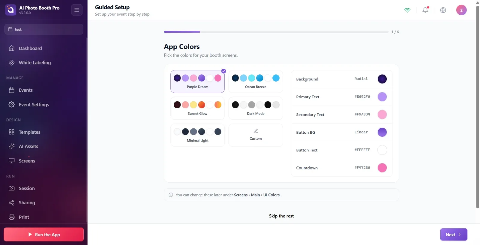
The first step is colors. At the top are 6 ready-made theme cards: Purple Dream, Ocean Breeze, Sunset Glow, Dark Mode, Minimal Light, Custom. Tapping a theme sets all 6 colors at once. Below it are the individual color rows: Background, Main Text, Secondary Text, Button BG, Button Text, Countdown. Tapping the color swatch on the right of each row opens the popover color picker — the exact same popover as the one on the Screens → Main settings page.
🔎 On-screen elements: 6 theme cards (previewed with small color dots); below them 6 color rows, each with a label + value + color swatch; tapping the swatch opens the popover color picker
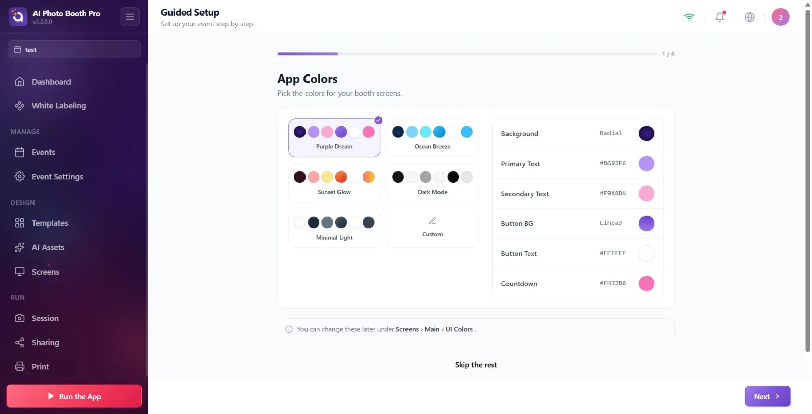
These 6 colors are the exact same settings as the UI Colors section on the Settings → Screens → Main Settings page (see Document 23). A value changed here shows up there too, and vice versa — it's not a separate copy.
Step 3 · Session — session behaviors (4 toggles)
Guided Setup → Session
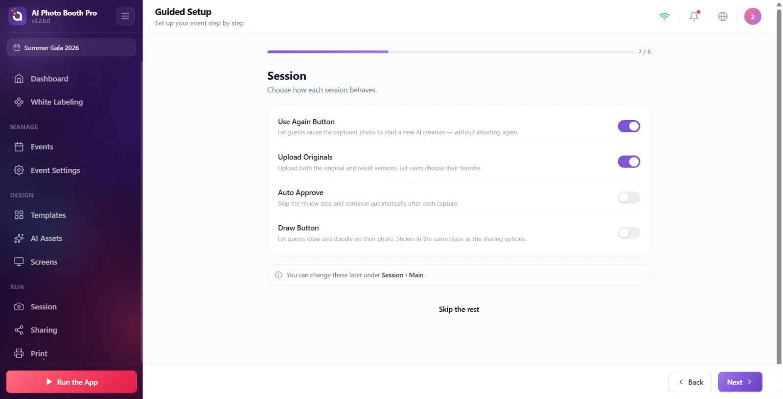
4 on/off toggles are listed in order: Use Again Button (lets the guest reuse a captured photo in a new AI generation), Upload Originals (uploads both the original and the result version), Auto Approve (skips the approval step and continues automatically after every capture), Draw Button (lets the guest draw on the photo). Each row's description sits under the toggle in small gray text.
🔎 On-screen elements: 4 rows, each with a title + description + toggle switch on the right
Step 4 · Sharing Buttons — sharing options (6 toggles)
Guided Setup → Sharing Buttons
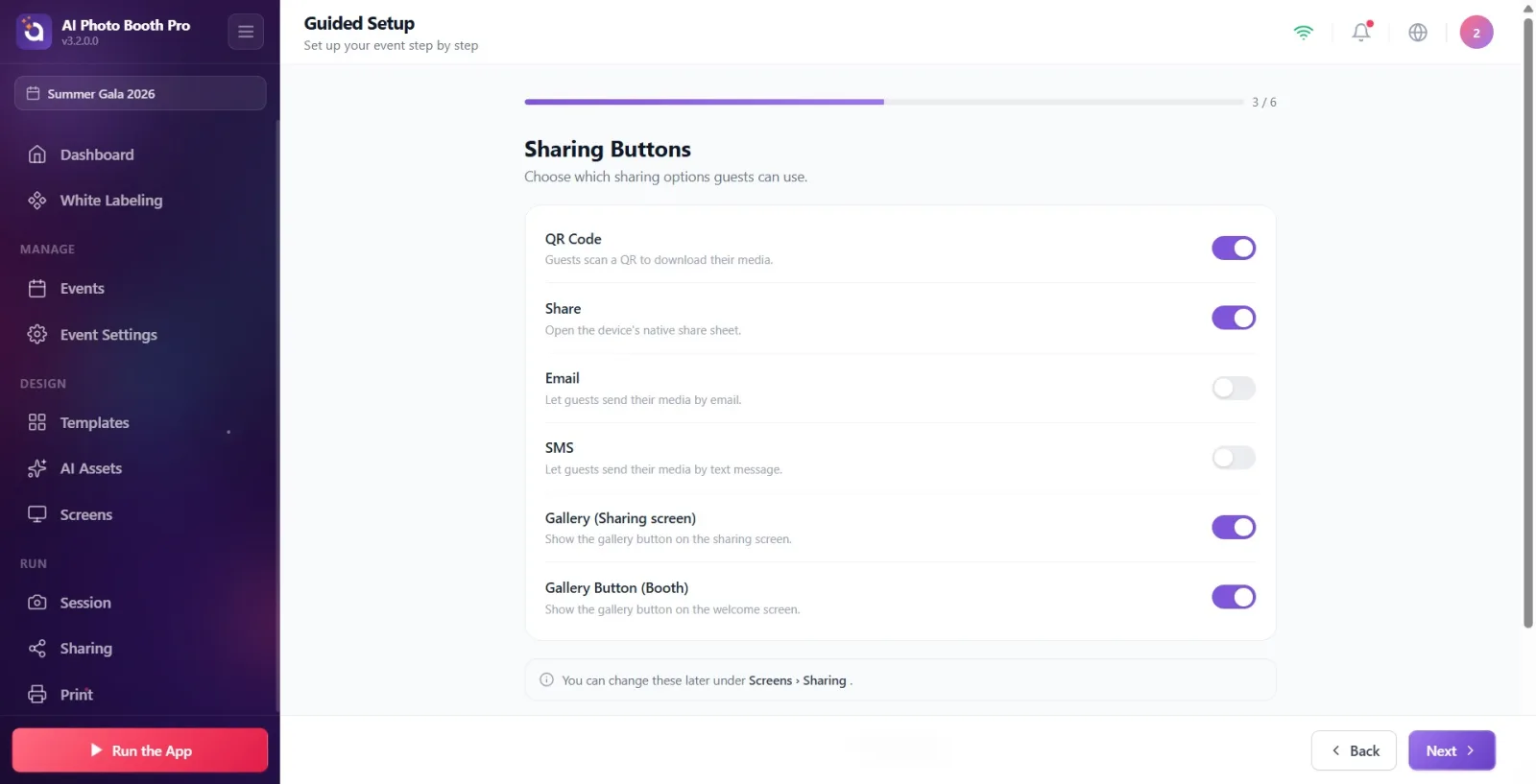
6 toggles determine which buttons appear on the sharing screen: QR Code, Share (the device's native share menu), Email, SMS, Gallery (Sharing screen), Gallery Button (Booth) (the gallery button on the welcome screen).
🔎 On-screen elements: 6 rows, each with a title + description + toggle switch on the right
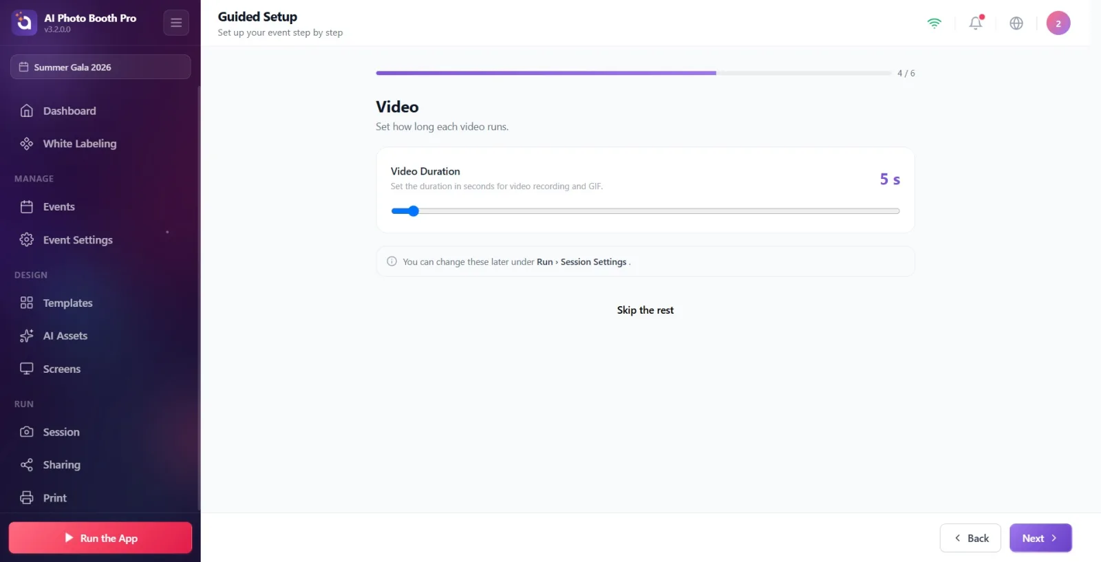
Step 5 · Video — duration setting (video events only)
Guided Setup → Video
This step is only added to the flow if the event type includes video/GIF capture (it never appears for photo-only events — the flow goes straight to the Camera step). A sliding Video Duration bar sets the video/GIF length between 1 and 120 seconds; the selected value is shown above it in large digits.
🔎 On-screen elements: Video Duration label + selected seconds value (large digits); a 1-120 range slider below it
Step 6 · Camera — camera selection and test
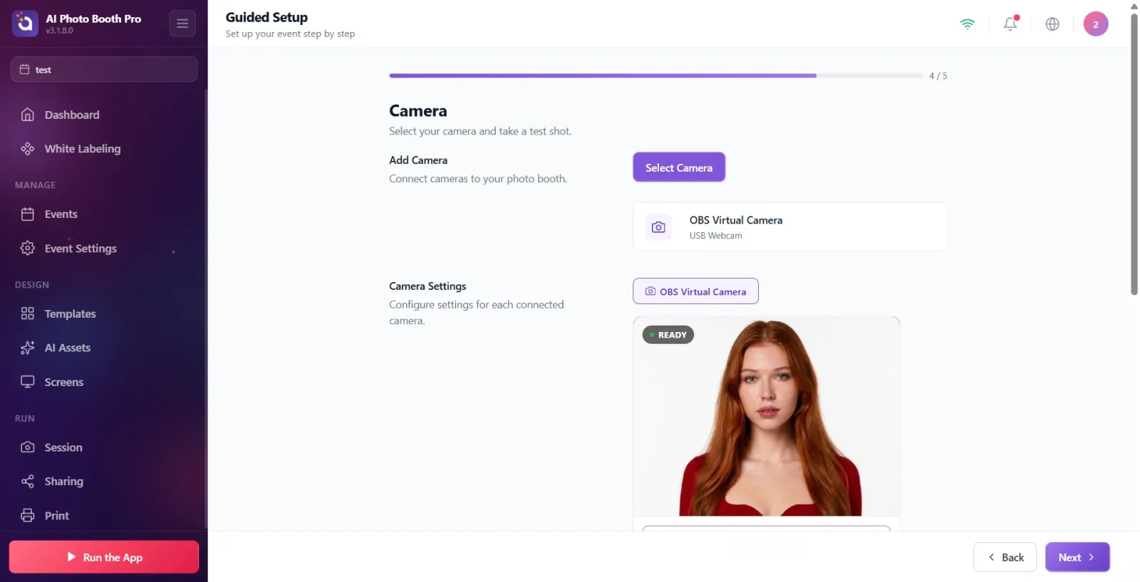
Guided Setup → Camera
This step embeds the exact same Settings → Event Settings → Camera page (camera selection, test capture, live preview). See Document 13 for the detailed walkthrough — it isn't repeated here, it's enough to know where it sits in the flow.
🔎 On-screen elements: Camera selection list + live preview + test capture button (the exact same panel as Document 13)
Related document: event-camera
Step 7 · You're Ready! — finish and Run the App
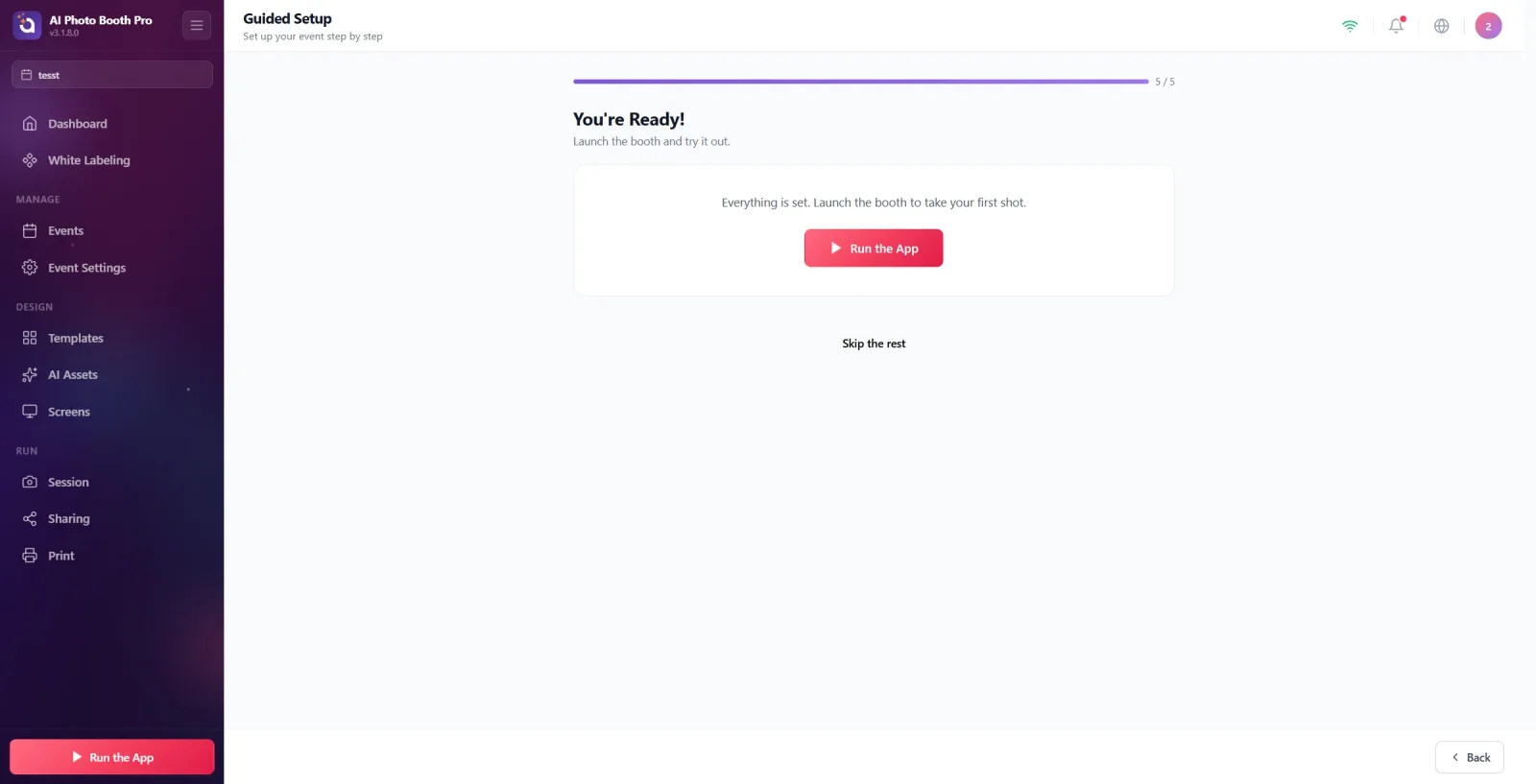
Guided Setup → You're Ready!
The final step. In the middle is a short info message, and below it the red Run the App button. Pressing this button switches the booth directly into live mode — Guided Setup ends here and the event is ready to use.
🔎 On-screen elements: Info text; a large red Run the App button in the middle (with a play icon)
The blue hint box under every step
Under every step except Camera there's a small info line: "You can change these later under [path]." — this line shows which Settings page permanently holds that step's settings (e.g. Screens › Main › UI Colors for Colors, Screens › Sharing for Sharing). An operator who wants to change the same setting after Guided Setup can use this line as a reference.