
Before this: What is Screen Design, How to Use General Tab?
The Sharing screen determines the APPEARANCE of the result and sharing screen shown to the guest after shooting: which element (result photo, action buttons, share buttons, QR, gallery, logo, progress bar) will appear where on the screen, its size, shape and background. This tab is layout/design only; The setup required for channels like email/SMS to actually work is a separate section (Sharing Settings).
- event-creation
step by step
Step 1 · Open Sharing tab
Screens (Screen Design page)
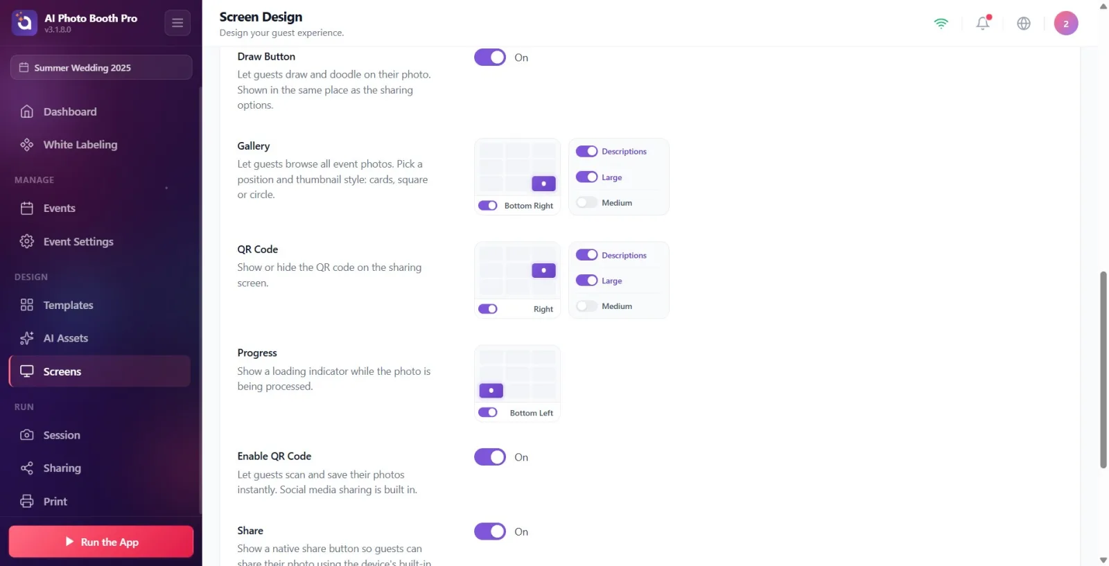
Open the 'Displays' page from Settings (header 'Screens', subtitle 'Design the guest experience.'). Click the 'Sharing Design' tab, which is the fourth tab from the left in the tab strip at the top. Tab order: 'General', 'Welcome', 'Capture', 'Share Design', 'Pause', then animation/text/audio tabs.
🔎 On-screen elements: Top tab strip; Sharing tab.
Step 2 · Get to know the page layout and live preview
Screen Design → Sharing
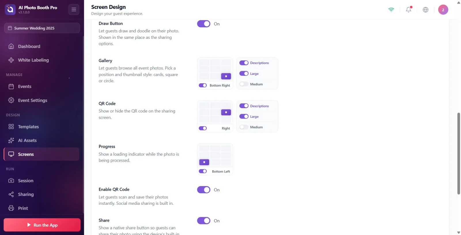
When the tab is opened, Screen Preview (the live preview that remains fixed at the top even when the page is scrolled) appears at the top; description: 'Live preview of the share screen. Any changes you make below will be reflected instantly.' Separate settings sections for each item are listed below. If you click on an element in the preview (e.g. result photo or buttons), the page will scroll to the relevant settings section; When you hover over a section, that element is framed in the preview. At the bottom right of the preview are the Reset to Defaults link and the Full Screen button.
🔎 On-screen elements: Screen Preview scene (clickable elements); Reset to Defaults connection; Full Screen button.
Step 3 · Learn location grid and option keys (common to all sections)
Screen Design → Sharing
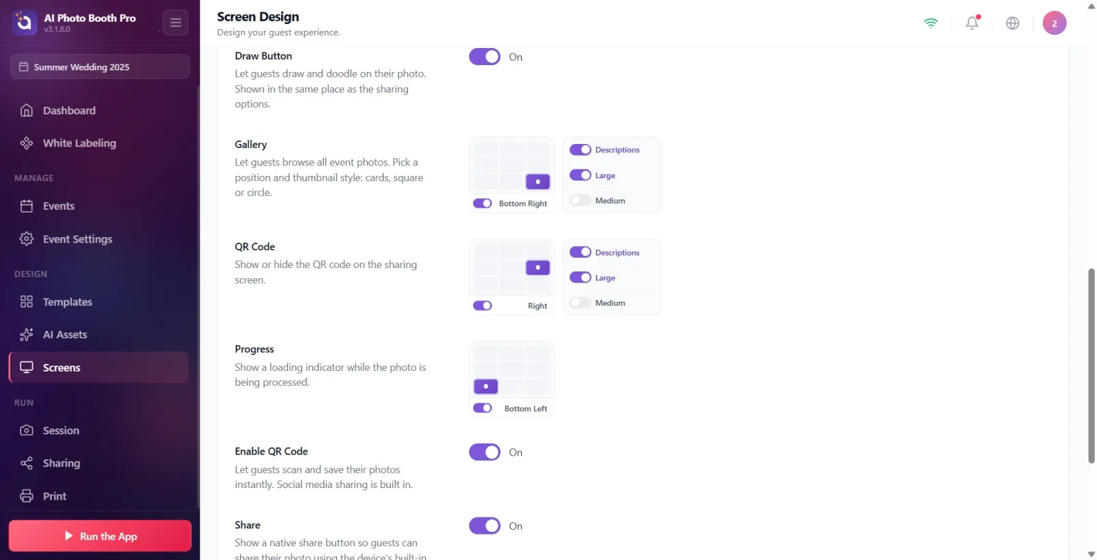
Most sections have a 3×3 grid of positions: clicking on one of the 9 cells places the item in that corner/edge on the screen. Names of the positions: Top Left, Top, Top Right, Left, Center, Right (right-center position), Bottom Left, Bottom, Bottom Right. The switch below the grid shows the selected location name; When you close the switch, it says Off and the item is completely removed from the sharing screen. When you open it again, it returns to its last position. The Large/Medium/Small (size) or Square/Pill (shape) switches next to the sections determine the appearance; The Descriptions switch shows/hides text labels next to buttons.
🔎 Elements on the screen: 3×3 location grid + on/off switch + location name label; Large/Medium/Small, Square/Pill, Descriptions switches.
Step 4 · Set Action Buttons
Screen Design → Sharing
Go to Action Buttons (description: 'Choose which action buttons (Done, Reuse, Retake) appear on the screen.'). Select your location from the location grid. Toggle which buttons appear with the 'Arrow' and 'Reuse' switches. Select the shape as Square or Pill. When Descriptions is on, text appears on the button, when it is off, only the icon appears.
🔎 Elements on the screen: Location grid; Arrow and Use Again keys; figure: Square/Pill; Descriptions key.
Step 5 · Position and size Result
Screen Design → Sharing
Go to Result (description: 'Position and size the captured photo in the sharing screen.'). Select your location from the location grid, then select your size with 'Large'/'Medium'/'Small'. If 'Large' is selected, the photo will enlarge to fill the screen and the position you choose will be applied as the alignment.
🔎 Elements on the screen: Location grid; size: Large/Medium/Small.
Step 6 · Place Sharing Options buttons
Screen Design → Sharing
Go to Sharing Options (description: 'Locate share buttons (Email, SMS, etc.) and choose appearance style.'). This group shows the Email, SMS, Print, QR and Share buttons as a vertical column in the preview. Select the location of the group from the location grid, its shape with Square/Pill; Show/hide button texts with Descriptions. NOTE: The actual appearance of a channel (Email/SMS) depends on whether the relevant channel is open and installed (Sharing Settings — separate section); Only the layout and appearance style are determined here.
🔎 Elements on the screen: Location grid; figure: Square/Pill; Descriptions key; Email/SMS/Print/QR/Share button group in preview.
Step 7 · Toggle Draw Buttonnu
Screen Design → Sharing
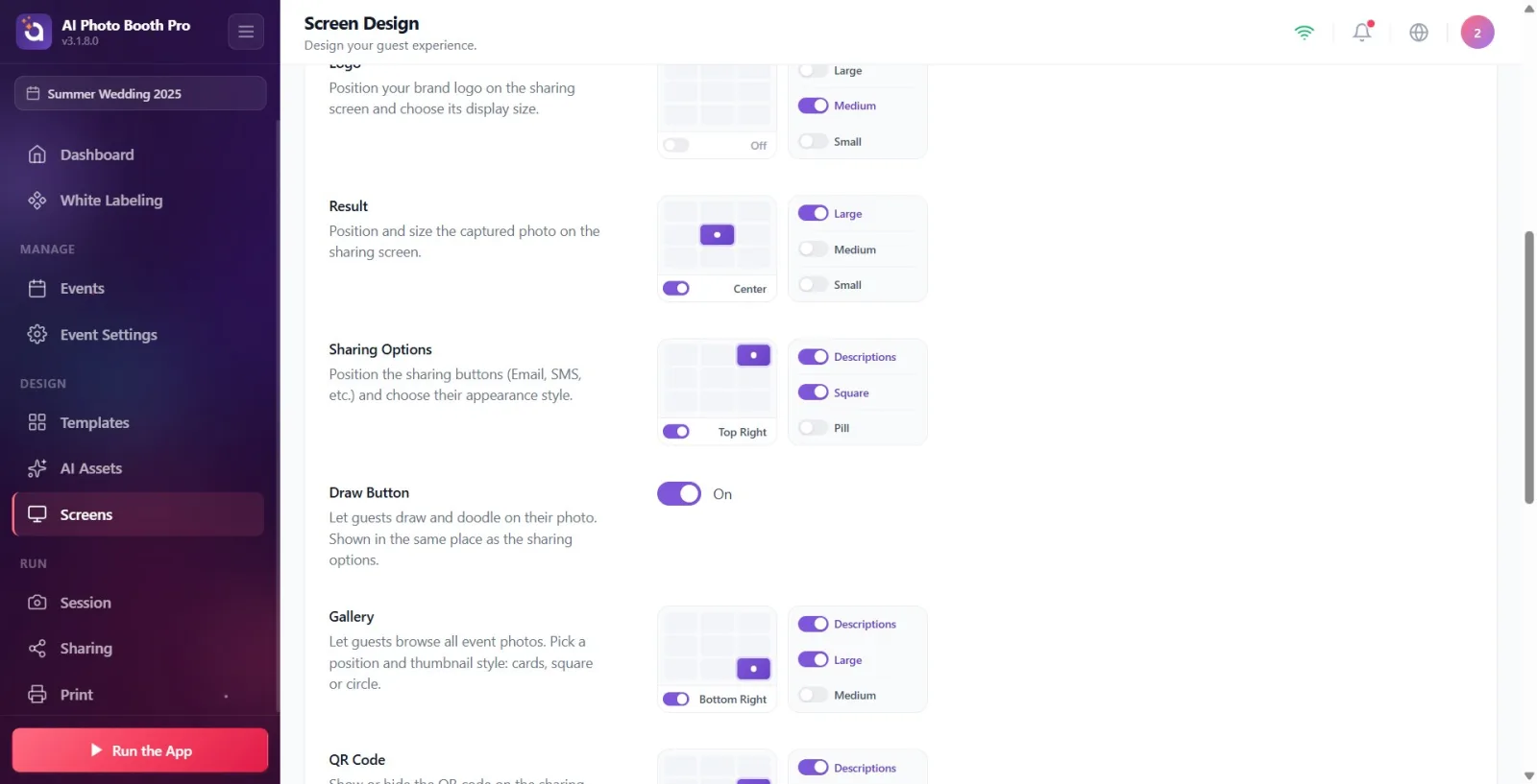
Draw Button section (description: 'Let guests draw and doodle on their photo. Shown in the same place as the sharing options.'). You turn it on and off with a single 'On'/'Off' switch (default is 'Off'). It has no separate location; appears at the top of the 'Sharing Options' group if it's on.
🔎 Items on the screen: Single on/off switch (On/Off).
Step 8 · Set the location and size of QR Code (desktop)
Screen Design → Sharing
Go to QR Code (description: Show or hide the QR code on the sharing screen.). Select location from location grid, size with Large/Medium; Show/hide 'to scan' text at bottom of QR with Descriptions. IMPORTANT: This section is hidden in phone (mobile) mode; because on mobile, instead of the embedded QR on the screen, a button shows the QR in a pop-up window. Therefore position/size is only valid on desktop/tablet screens.
🔎 Elements on the screen: Location grid; size: Large/Medium; Descriptions key. (Hidden on mobile.)
Step 9 · Set master key Enable QR Code
Screen Design → Sharing
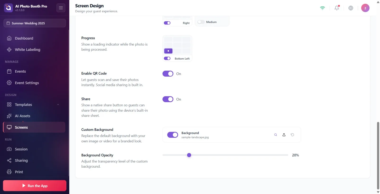
Go to Enable QR Code (description: 'Enable guests to instantly scan and save their photos. Social media sharing feature included.'). You can turn on/off the entire QR feature with a single switch. This controls the property itself, unlike just position/size in the QR Code section, and it remains visible on mobile as well.
🔎 On-screen items: Single on/off switch (default on).
Step 10 · Toggle Share (local sharing) button
Screen Design → Sharing
Go to Share (description: 'Show native share button so guests can share their photos using the device's built-in share sheet.'). You can turn on/off the device's native sharing button with a single switch.
🔎 On-screen items: Single on/off switch (default on).
Step 11 · Position and size Gallery
Screen Design → Sharing
Go to Gallery (description: 'Allow guests to browse all event photos. Choose a location and thumbnail style.'). Select your location from the location grid, size with 'Large'/'Medium'; Show/hide 'Gallery' tag with 'Descriptions'.
🔎 Elements on the screen: Location grid; size: Large/Medium; Descriptions key.
Step 12 · Position and size Logo
Screen Design → Sharing
Go to Logo (description: 'Position your brand logo on the share screen and choose the display size.'). Select your location from the location grid and size with 'Large'/'Medium'/'Small'. NOTE: The logo is OFF by default on this screen; When you turn on the switch, it defaults to Top. The Logo IMAGE is not loaded here — it is loaded from the General (Main) tab; This section only determines the location and size of the logo.
🔎 Items on the screen: Position grid (off by default, Top when turned on); size: Large/Medium/Small.
Step 13 · Position Progressnu
Screen Design → Sharing
Go to Progress (description: Show a loading indicator while the photo is being processed.). There is only a location grid here; Choose where the progress indicator appears on the screen while the photo is being processed.
🔎 Elements on the screen: Location grid only.
Step 14 · Load Custom Background
Screen Design → Sharing
Go to Custom Background (description: 'Replace the default background with your own image or video for a branded look.'). Use the file selector titled 'Background' ('Upload a custom background image or video'); You can choose image OR video. Turn on/off the background with the switch in the section, return to the default image with the restore button. File selection is made with the native file selector. If you do not define your own background, the background in the General tab is inherited.
🔎 Items on the screen: Background file selector (Image/Video); on/off switch; restore button.
Step 15 · Set Background Opacity
Screen Design → Sharing
Go to Background Opacity (description: Adjust the transparency level of the custom background.). Adjust the visibility/transparency level of the background with the slider from 0–100; the percentage value is shown on the right (default 20%). The slider is active only if a background is defined; If there is no background it appears faded/passive.
🔎 On-screen elements: 0–100 slider + percentage indicator (disabled if there is no background).
Step 16 · Preview full screen and reset if necessary
Screen Design → Sharing
Preview the share screen in a large window close to the actual ratio with the Full Screen button at the bottom right of the preview (click outside the window or on the cross icon to close). If you want to reset all item positions to factory settings, click the Reset to Defaults link; Confirm the confirmation window that appears ('This action will reset all item positions on the sharing screen to their default settings. This cannot be undone.') Confirm with 'Reset' and cancel with 'Cancel'.
🔎 Items on the screen: Full Screen button; fullscreen preview window + close (cross); Reset to Defaults connection; confirmation window Reset/Cancel.
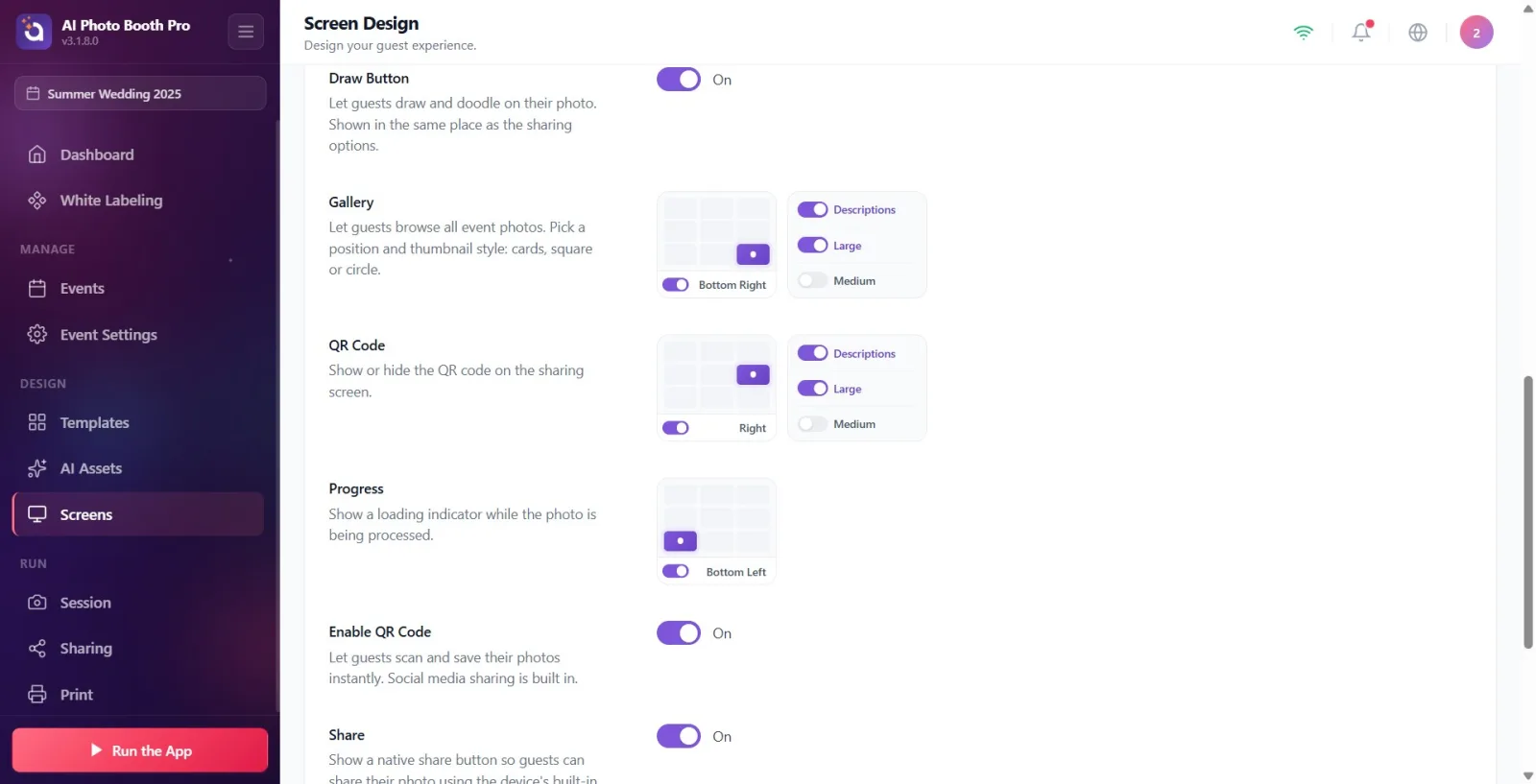
The preview is live: every change you make is reflected immediately. If you click on an item in the preview, the page scrolls directly to that item's settings section.
Turning OFF the switch below the location grid not only moves the item, it removes it from the sharing screen entirely. When you open it again, it returns to its last position.
The Descriptions switch controls the text labels next to buttons: when off, buttons appear as icons only, when on, they appear as icon + text.
Logo IMAGE and brand colors come from the General (Main) tab; The Sharing tab determines only the location and size of the logo. The logo is off by default on this screen.
The background defined here Custom Background overrides that in the General tab; If you don't define any, the General background will be inherited. Background Opacity default is 20%, increase the percentage if the background appears dark.
The QR Code part (position/size) and the Enable QR Code part (feature toggle) are different: one controls the placement, the other controls the feature itself.
There is no separate button for recording; It is saved every time you change the setting key.
After finishing the layout, get a preview close to the real rate with Full Screen; Verifies how it will appear on the kiosk screen.
Looking for the background IMAGE in the color settings of the General tab: the Custom Background file selector is used for the share screen specific image/video.
Looking for the QR Code location section in phone (mobile) mode: this section is hidden on mobile (on mobile the QR is shown with a button + window). To turn the QR on or off completely, use the 'Enable QR Code' switch, which also appears on mobile.
Adjusting the location of sharing buttons and complaining that Email/SMS still doesn't appear: this tab is just layout/design; For the channel to actually work, the relevant channel must be open and installed in Sharing Settings.
Thinking that the item will just be moved when you turn off the position switch: when the switch is closed, the item is completely removed from the screen (Off).
Surprised that the logo does not appear: the logo is turned off by default on this screen and its image is loaded from the General tab.
Stuck with the Background Opacity slider being disabled: the slider is only active when a background is defined; add Custom Background first (or use background General).
mixing QR Code (layout) with Enable QR Code (feature key); If QR is not visible, first check if Enable QR Code is on.
Related topics
Sharing Settings Shooting Screen Design General (Main) Screen Design — Logo and Colors