
Before this: What is Screen Design, How to Use General Tab?
Welcome How to Design the (Welcome) Screen?
The Welcome screen is the first (welcome) screen that guests see when the booth opens. This tab places each element above the screen — live camera preview, call text (CTA), session start buttons, gallery, and logo — in a 3×3 grid of positions; You set size, format, alignment, and label options. You can also give a custom background (image or video) and background opacity. The live preview (WYSIWYG) at the top shows all changes immediately. The color, theme, main background and the logo image itself come from the General tab and are reflected here as read-only.
- An event must be created and selected — all settings on this tab are specific to the selected event (the background loader will not work fully when the event is not selected)
- For color/theme, main background and logo image, it is recommended to set the General (Main) tab first; the preview reflects these
- A camera must be connected/selected to see the live camera preview (otherwise the schematic camera icon will appear in the preview).
step by step
Step 1 · Open Welcome tab and get to know the live preview
Screen Design → Welcome → Screen Preview
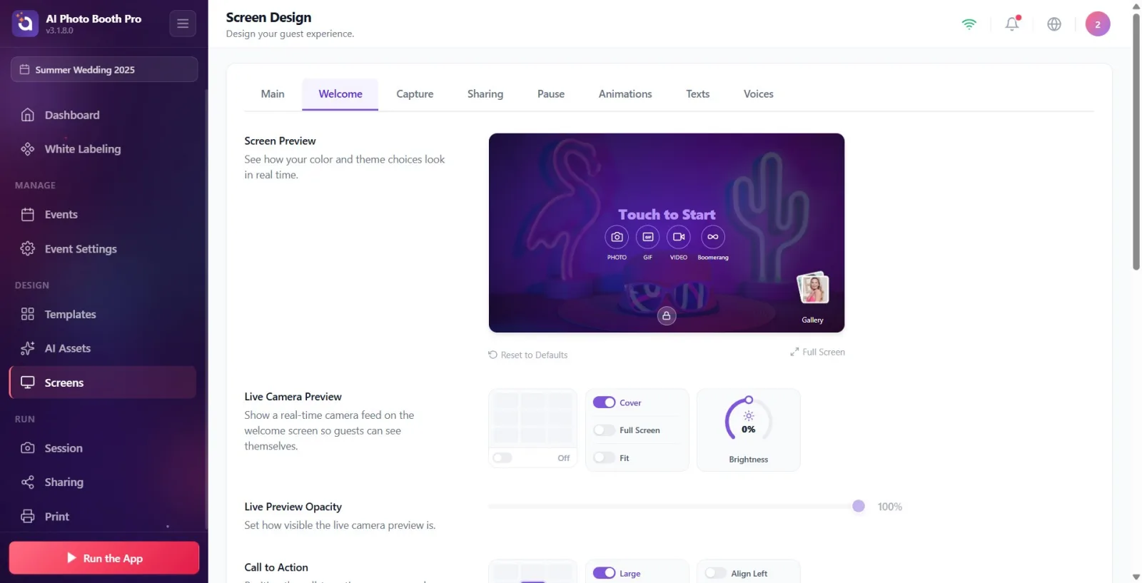
In the settings, open the Screen Design page from the menu on the left, click on the Welcome tab from the tab strip at the top. The Screen Preview card, which remains fixed at the top of the page, shows the current status of the welcome screen in real time. Any changes you make to each section below will instantly appear here. If you click on an element in the preview (camera, CTA, buttons, gallery, logo), it will automatically scroll to the relevant settings section; On hover, the item is highlighted with a dashed purple frame.
🔎 Items on the screen: Top tabs: General, Welcome, Capture, Sharing, Pause, Animations, Texts, Voices. Fixed preview card with title Screen Preview; Reset to Defaults link and Full Screen button at the bottom right.
Step 2 · Live Camera Preview — select its location and toggle on/off
Screen Design → Welcome → Live Camera Preview
In the Live Camera Preview section, select the location of the live camera image on the screen by clicking a cell in the 3×3 location grid; The location you selected is indicated in text below the grid (Top Left, Top, Center, Bottom Right etc.). If you turn off the switch to the right of the grid, the camera preview is hidden (label becomes Off); When you open it again, it returns to the last position. It is recommended to keep this preview open so guests can see for themselves.
🔎 Elements on the screen: 3×3 PositionGrid + On/Off switch and position label to the right of it.
Step 3 · Camera fill mode (Overlay / Full Screen / Fit) — pay attention to the locked position
Screen Design → Welcome → Live Camera Preview
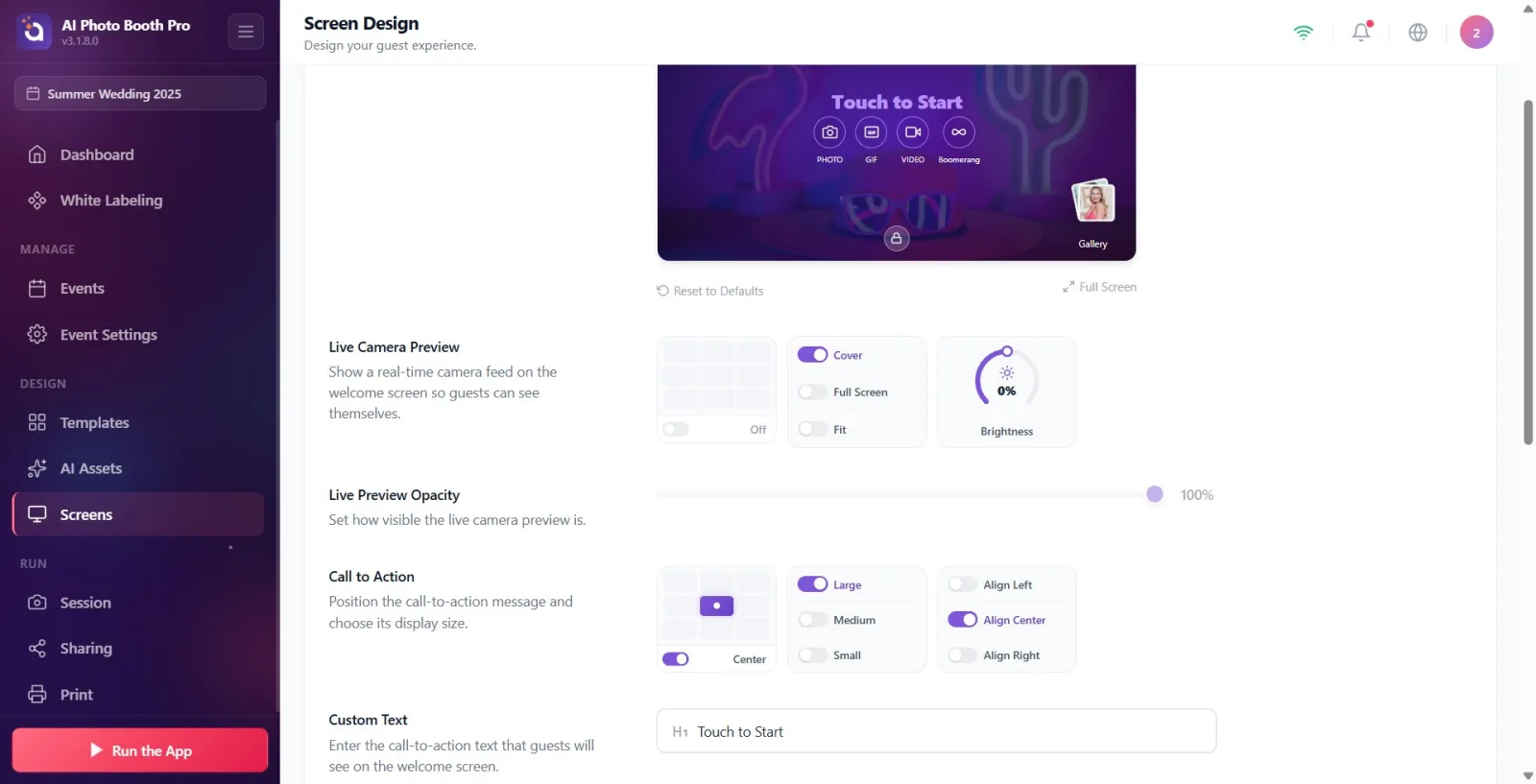
Turn on the switch for one of the fill mode options in the same section: Cover (fills the camera in the box with no gaps), Full Screen (spreads the camera across the entire screen), or Fit (fits it with a margin). When selecting Full Screen or Fit the 3×3 position grid is locked/dimmed as the camera covers the entire screen and only the On/Off switch works — this is not a bug. When you return to Cover, the location grid is reactivated and your previous location is restored.
🔎 Items on the screen: Fill mode option switches: Cover / Full Screen / Fit. Locked (dimmed) PositionGrid in Fullscreen/Fit mode.
Step 4 · Adjust camera brightness
Screen Design → Welcome → Live Camera Preview
Darken or lighten the live camera image between -50 and +50 by turning the Brightness dial (rotary knob) to the right of the section. This value shares the same source as the preview brightness in the Camera settings: changing it in one will be reflected in the other. The change is applied live to the preview.
🔎 Items on the screen: rotary knob labeled Brightness, range -50…+50.
Step 5 · Adjust Live Preview Transparency
Screen Design → Welcome → Live Preview Opacity
Determine how visible the live camera preview will be by dragging the slider in the Live Preview Opacity section from 0%–100% (100 = clear, 0 = invisible). This slider is dimmed/inactive when the camera preview is off; First, open the camera preview from above.
🔎 On-screen elements: 0–100 range slider + percentage indicator. Disabled (dimmed) when camera preview is off.
Step 6 · Call to Action (CTA) — position, size and alignment
Screen Design → Welcome → Call to Action
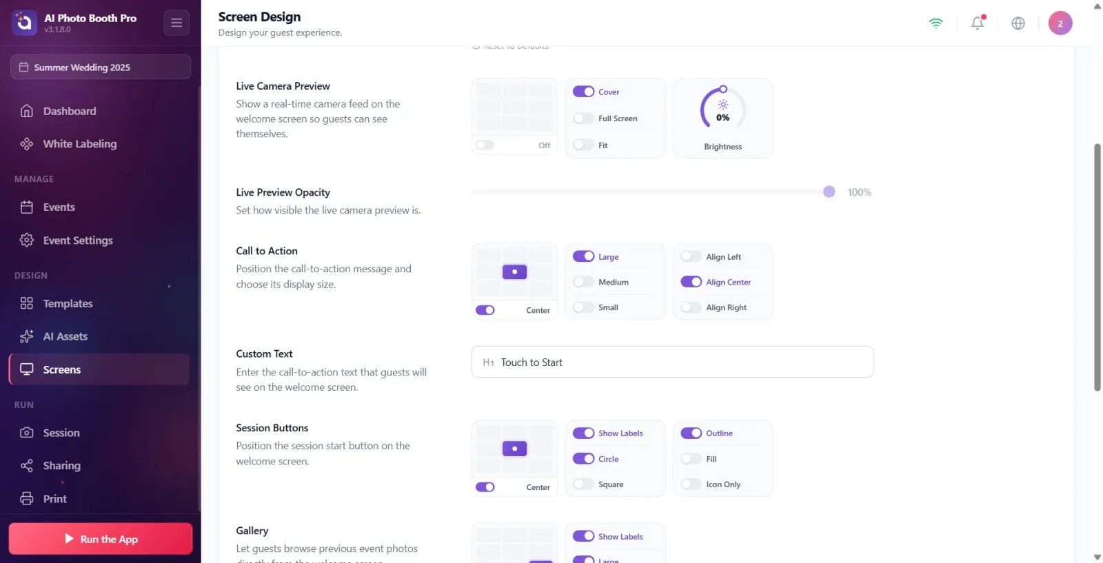
In the Call to Action section, select the location of the call text (CTA) on the screen from the 3×3 grid (default Center). Adjust the text size by turning on the switch for one of the Large / Medium / Small options. Set text alignment with Align Left / Align Center / Align Right. Note: If CTA and Session Buttons are both taken to Centere, they will be stacked vertically in the preview.
🔎 Elements on the screen: PositionGrid; dimension keys (Large/Medium/Small); alignment keys (Align Left/Align Center/Align Right).
Step 7 · Custom Text — Write the CTA call text
Screen Design → Welcome → Custom Text
In the Custom Text field, type the call text to be displayed to guests (default is Touch to Start; when the field is empty, the Touch to Start hint appears in the box). The text you type is instantly reflected in the CTA in the preview. If you leave the field blank on purpose, the CTA will also appear blank in the preview (similar to the app behavior).
🔎 Elements on the screen: Text input box (form field with icon), Touch to Start placeholder.
Step 8 · Session Buttons — location, format, labels and style
Screen Design → Welcome → Session Buttons
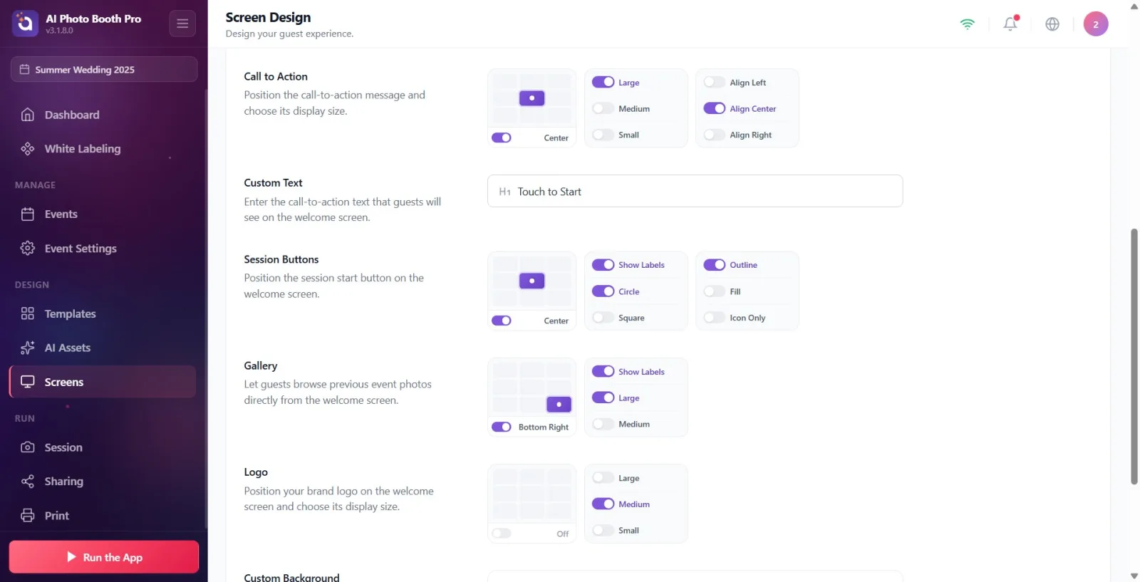
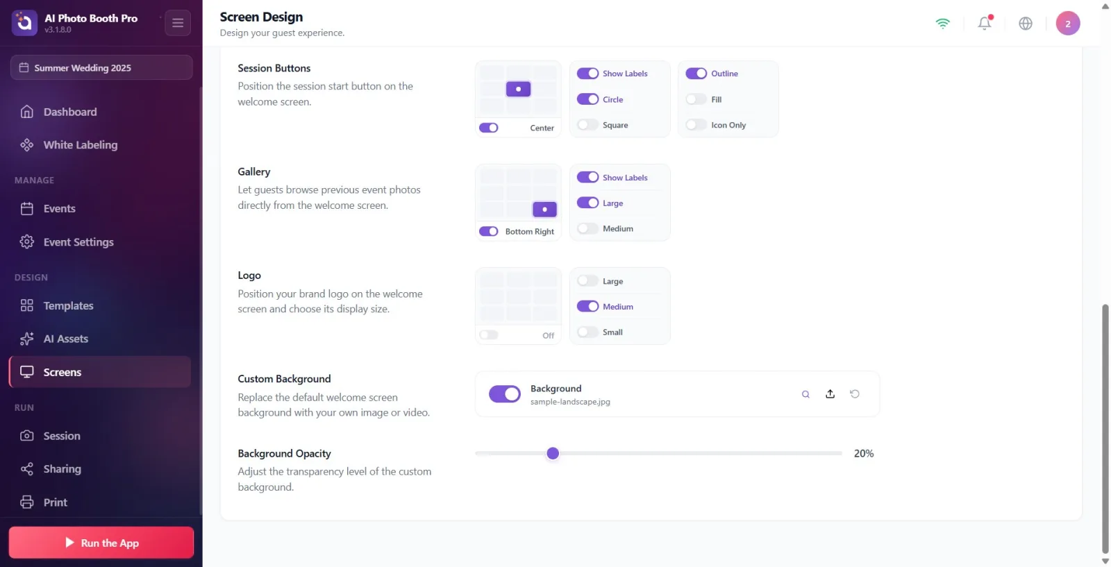
In the Session Buttons section, select the location of the session launch buttons from the 3×3 grid (default Center). Select button format as Circle or Square; Turn on/off the visibility of the texts under the button (PHOTO / GIF / VIDEO / BOOMERANG) with the Show Labels switch at the beginning of this selector. Choose the button style from Outline (border only), Fill (color filled), or Icon Only. Note: The button label texts themselves are edited in the Texts tab; only their visibility is set here.
🔎 Elements on the screen: PositionGrid; format keys (Circle/Square) + key Show Labels in header; style switches (Outline/Fill/Icon Only).
Step 9 · Gallery — location, size and tag
Screen Design → Welcome → Gallery
In the Gallery section, select the location of the gallery button from the 3×3 grid (default Bottom Right). Select your size Large or Medium. Toggle the visibility of the gallery label (Gallery) with the Show Labels switch. The gallery allows guests to browse previous event photos; If you don't want it, hide it completely by turning off the switch next to the grill.
🔎 Elements on the screen: PositionGrid; dimension keys (Large/Medium) + key Show Labels in header.
Step 10 · Logo — position and size (image comes from General tab)
Screen Design → Welcome → Logo
In the Logo section, select the position of your brand logo from the 3×3 grid (default is top-middle) and adjust its size with one of the Large / Medium / Small options. Important: The Logo IMAGE itself is not loaded in this tab — it is set in the General (Main) tab; Here you just place and size. If the logo is not yet loaded, a default placeholder icon appears in the preview. Turn off the switch next to the grill to hide the logo completely.
🔎 Items on the screen: PositionGrid (default open position top-middle); dimension keys (Large/Medium/Small).
Step 11 · Custom Background — upload your own image or video
Screen Design → Welcome → Custom Background
In the Custom Background section (line titled Background), press the upload button on the right and select an image OR video from the local file chooser that opens (max. 50 MB). The video plays automatically, without sound and on loop. Toggle the background completely on/off with the switch at the beginning of the line. The restore (reset) button returns to the default sample image — it does NOT remove the background; turn off switch to remove. This line inherits the main background in the General tab until you load your own file; When you load/close/reset, a special background becomes valid for this tab.
🔎 Elements on the screen: File upload widget: Open/Close switch, file name + size information, Preview / Load / Reset buttons; Native file selector that supports image + video.
Step 12 · Adjust Background Opacity
Screen Design → Welcome → Background Opacity
Set the transparency level of the custom background by dragging the slider in the Background Opacity section from 0%–100% (default 20% — keeping the background dim and highlighting the camera and CTA). If the background is muted or absent, this slider will be dimmed/inactive; turn on the background first.
🔎 On-screen elements: 0–100 range slider + percentage indicator. Disabled (dimmed) when there is no background.
Step 13 · Reset to Defaults and Full Screen preview if necessary
Screen Design → Welcome → Screen Preview
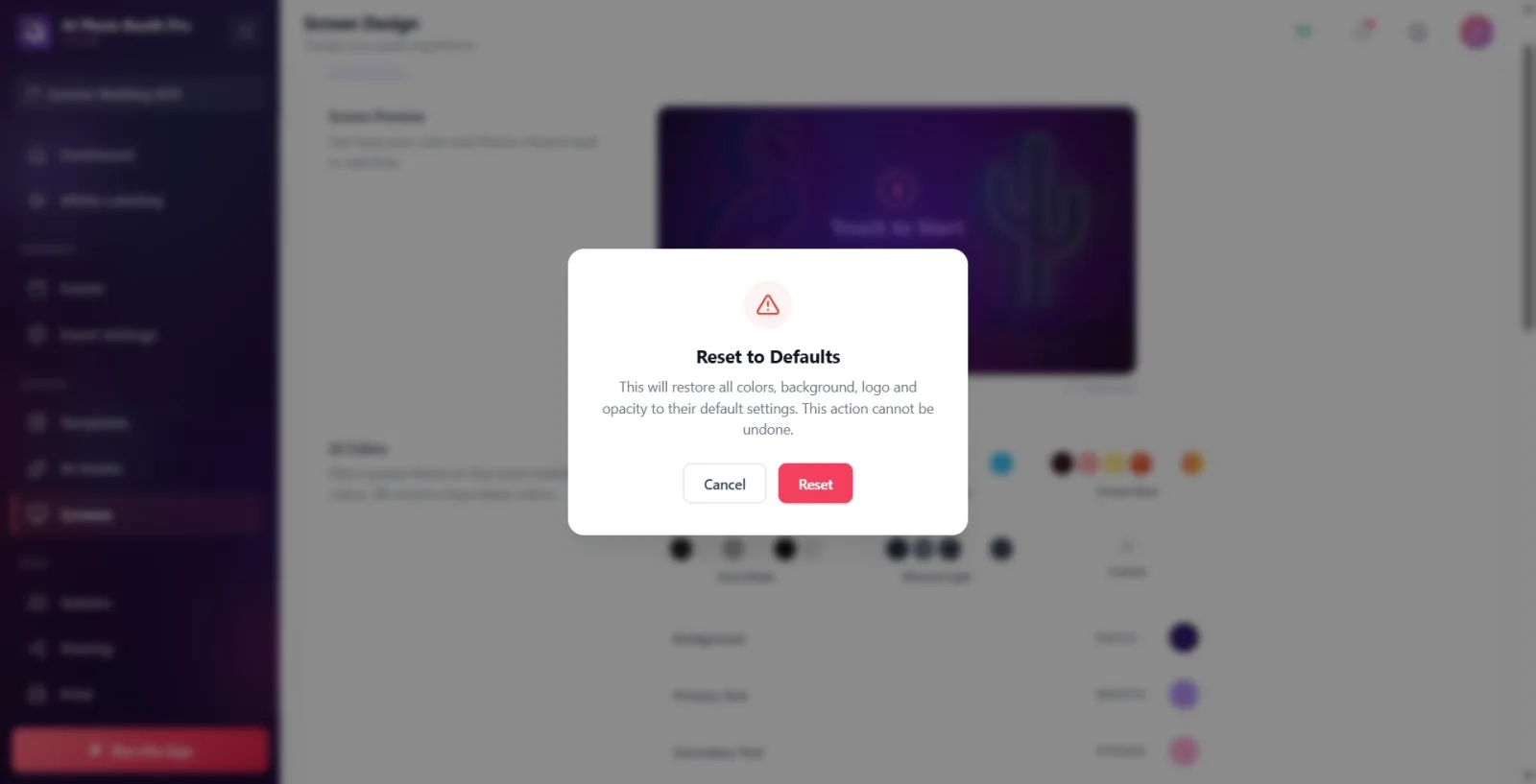
If you want to reset all locations and options, click the Reset to Defaults link at the bottom of the preview card. In the confirmation window that appears ('This action will restore all item positions and options on the welcome screen to their original settings. This cannot be undone.') Confirm with 'Reset' or 'Cancel'. To see your designed layout larger, open the preview in full screen with the 'Full Screen' button; Click outside or the close (X) button to close it.
🔎 Items on the screen: Reset to Defaults link; confirmation window (Reset / Cancel buttons); Full Screen button and fullscreen preview overlay.
The preview is WYSIWYG: the colour, theme, main background and logo image come from the 'General' tab and are reflected live here. It is best to set the General tab before designing the welcome screen.
Clicking on any item in the preview automatically scrolls to the relevant settings section — this is the quickest way to find out which item is set where.
Clicking a cell in the location grid places the item there; turning off the switch next to the grid hides the element completely (Off).
If the CTA and Session Buttons are both set to Center, they will be stacked vertically — useful for a balanced, centered splash screen.
It is normal for the location grid to be locked/dimmed when the camera is in Full Screen or Fit mode; Location is meaningless as the camera takes up the entire screen, only On/Off works.
The background can be both visual and video; The video plays automatically, silently and on loop. Pay attention to the file size in videos (max. 50 MB).
The camera Brightness setting and the preview brightness in the Camera tab are the same setting — changing one changes the other.
Keeping the background opacity low (default 20%) makes the camera image and call text stand out; 100% makes the background fully visible.
It's a mistake to mistake the location grid for being dimmed when the camera is in Full Screen/Fit mode — in these modes location is disabled, only the toggle switch works. Set fill mode to Cover to select position.
Searching for the logo image in this tab — the logo file is loaded in the General (Main) tab; Only the position and size are set in the Welcome tab. If the logo is not installed, a placeholder icon appears in the preview.
Trying to edit button label texts (PHOTO/GIF/VIDEO/BOOMERANG) in this tab — these texts are in the Texts tab; Here their visibility is toggled on and off only with Show Labels.
Surprised that the Live Preview Opacity or Background Opacity slider is dimmed/passive — transparency is disabled when the camera preview is off, opacity slider is disabled when there is no background. Open the relevant item first.
Pressing the Reset (restore) button to remove the background — reset will revert to the default sample image, it will NOT remove the background. To remove, turn off the switch at the beginning of the line.
Thinking that the Reset to Defaults link only resets the currently edited section — this resets the positions and options of ALL welcome items and is irreversible.
Wondering why the Custom Text field is blank and the CTA is not visible — if the text is deleted on purpose the CTA remains blank in the preview as well (same as app behavior).
Selecting a file that is too large (over 50 MB) for the background — will result in an upload size limit error; use a smaller file.
Related topics
General (Main) Tab — Color, Theme, Logo and Main Background Texts Tab — Button and CTA texts Shooting Screen Screens Page