
Before this: What is Screen Design, How to Use General Tab?
Texts How to Customize?
The Texts tab of the Screen Design page allows you to change all button texts, titles and messages that guests see on the booth (kiosk) screens with your own expressions or translations. First you select the guest language, turn on the Customize Texts switch, then edit each tag screen by screen (General, Welcome, GlamBot, Capture, Share, Checkout, page titles); The text you enter is event specific, and the fields you leave blank represent the built-in default of the selected language.
- event-creation
step by step
Step 1 · Open Texts tab
Screen Design → Texts
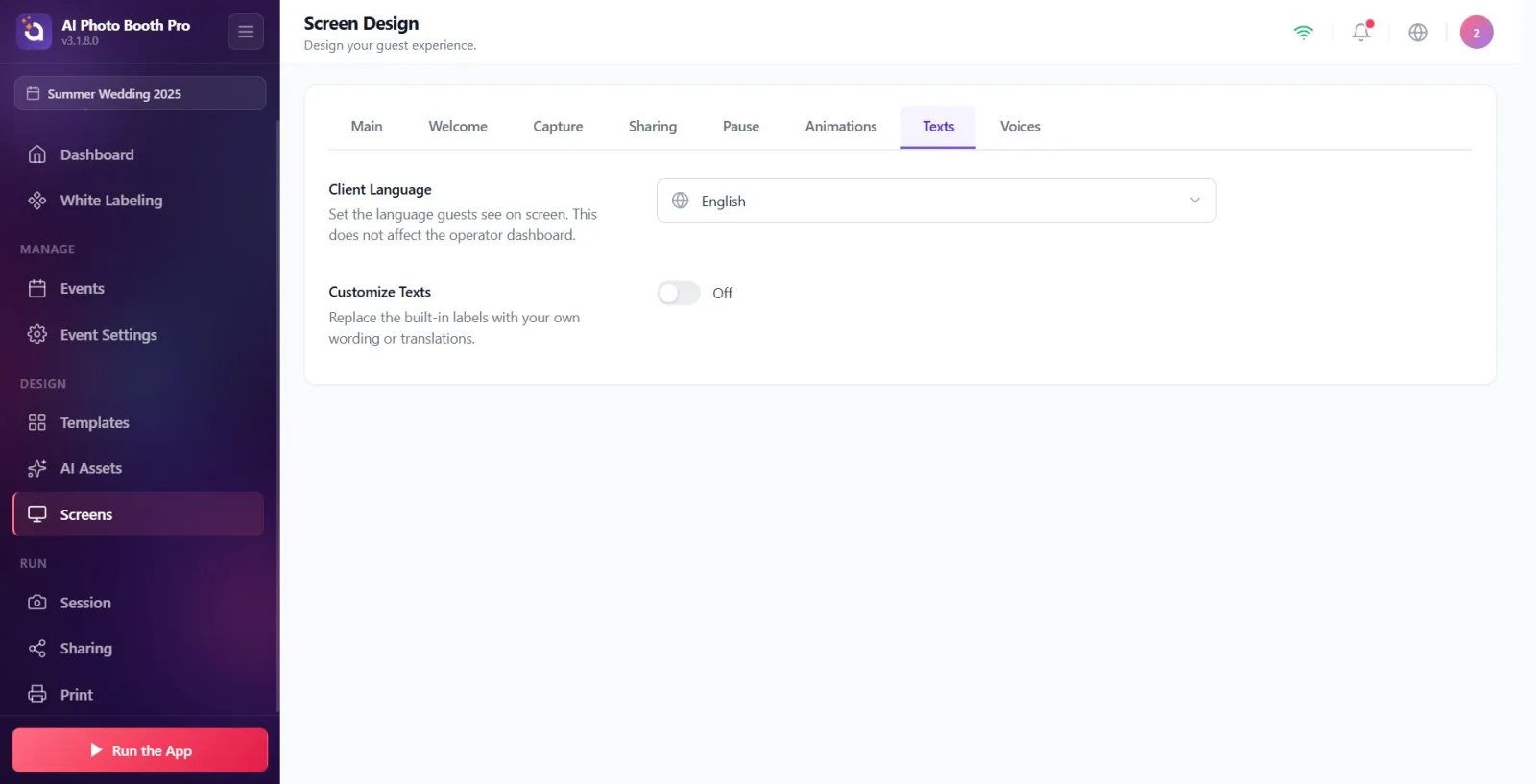
Make sure an event is selected (texts are saved specifically for the event; if the event is not selected, changes will not be saved). Open the 'Screen Design' (Displays) page in Settings and switch to the 'Texts' tab from the tab strip at the top. The tab is located at the end of the ribbon, between 'Animations' and 'Sounds'.
🔎 Items on the screen: Top tab strip: General, Welcome, Capture, Sharing, Pause, Animations, Texts, Voices.
Step 2 · Select guest language (Client Language)
Screen Design → Texts
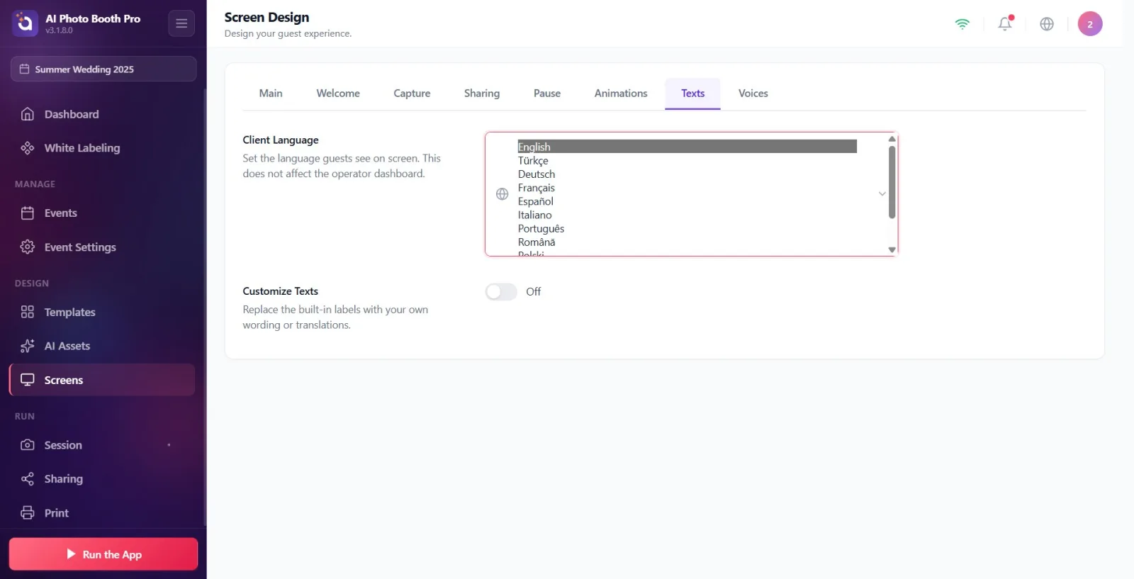
Select the language guests will see on the booth screen from the Client Language drop-down menu at the top. This setting determines the language of both built-in default text and pale gray placeholder text in fields. As stated in the description, this selection only affects the guest screen and does not change the operator panel (Settings interface). IMPORTANT: Choose the language BEFORE entering your custom text — changing the language later will overwrite any custom text with the new language defaults.
🔎 On-screen elements: Client Language title + description 'Set the language that guests see on the screen. This does not affect the operator panel.'; drop-down menu with globe icon — 11 options: English, Turkish, Deutsch, Français, Español, Italiano, Português, Română, Polski, Русский, Čeština.
Step 3 · Turn on Customize Texts key
Screen Design → Texts
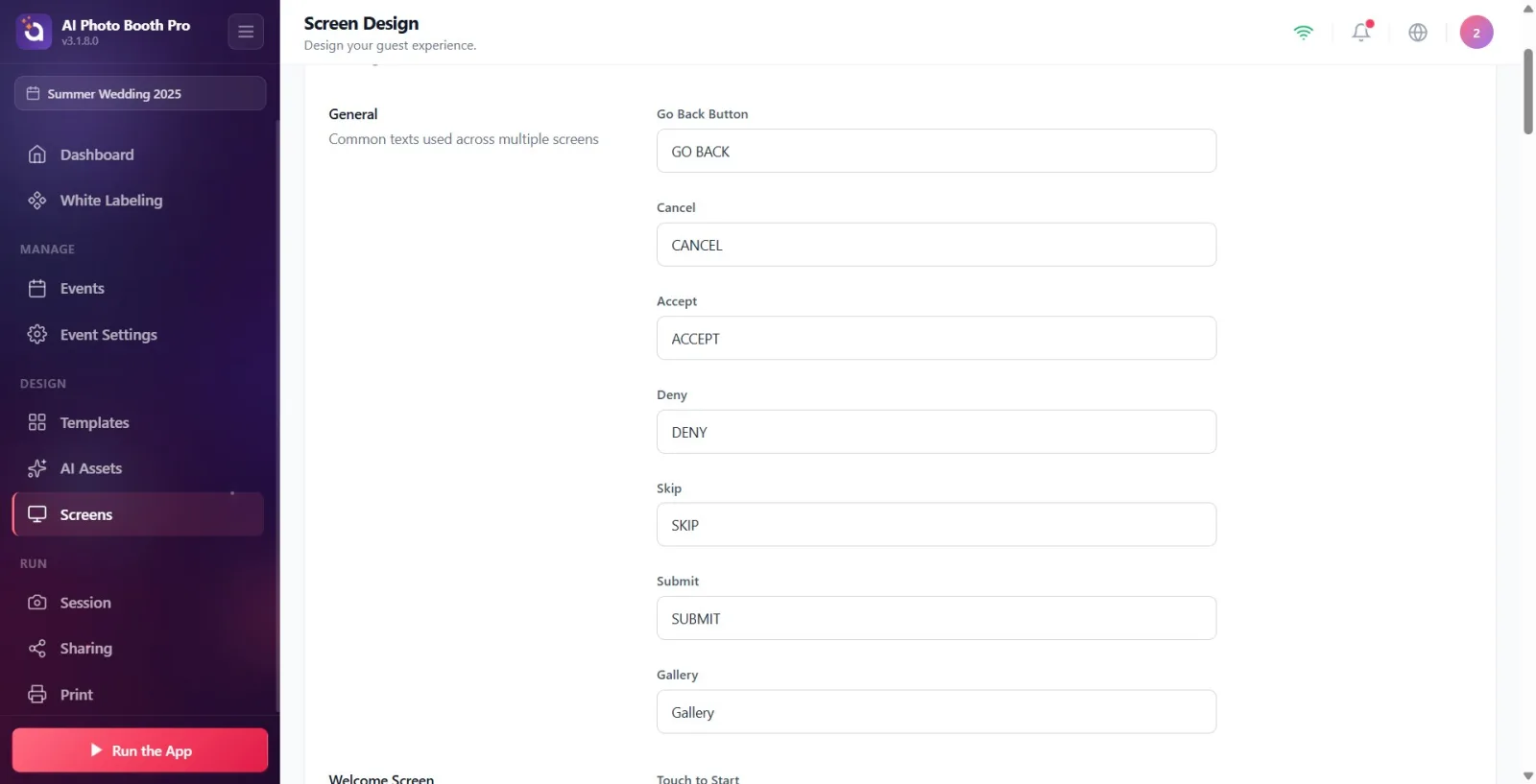
Turn on the Customize Texts toggle. It is off by default; When off, all screens use built-in default text and editing sections remain hidden. When you turn on the switch, all text editing sections (General, Welcome Screen, GlamBot Screen, Capture Screen, Screen Sharing, Payment screens, page titles) appear, grouped screen by screen at the bottom.
🔎 Items on screen: Customize Texts title + description 'Replace built-in labels with your own expressions or translations.'; on/off switch (default off).
Step 4 · Edit a text field (working logic)
Screen Design → Texts
Her ayar; It is a label at the top and a text box at the bottom. The pale gray text (placeholder) in the box is the built-in default in the selected language. As soon as you write your own text, that area will show your text in the booth. Changes are automatically saved (~0.5 sec after you stop typing) — there is no separate Save button. If you leave a field blank, that screen reverts to default text (no blank text shown). There is no character limit on the fields; For short button texts, it is recommended to keep it concise.
🔎 Elements on the screen: Label (form-label) + single line text box (form-input); pale gray placeholder = default text; automatic recording (500 ms debounce).
Step 5 · Edit general texts
Screen Design → Texts
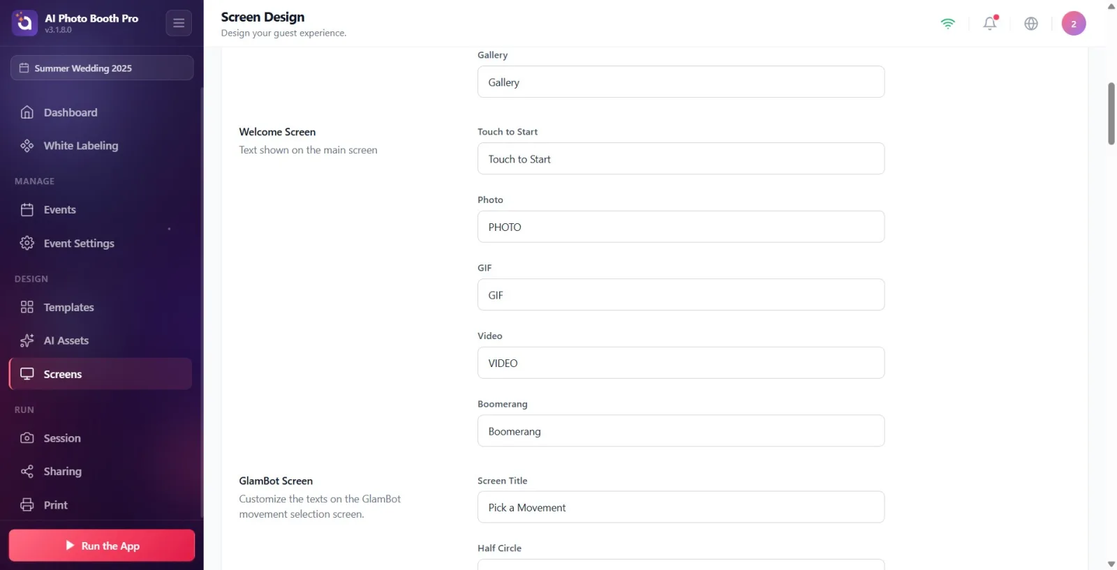
The General section (description: Common texts used across multiple screens) contains common buttons that repeat on many screens. Edit the following fields: Go Back Button (default RETURN), Cancel (CANCEL), Accept (ACCEPT), Deny (REJECT), Skip (SKIP), Submit (SEND), Gallery (Gallery).
🔎 Elements on the screen: General chapter title; 7 text boxes: Return Button, Cancel, Accept, Reject, Skip, Send, Gallery.
Step 6 · Edit Welcome Screen texts
Screen Design → Texts
The Welcome Screen section (description: Text shown on the main screen) contains the text on the booth's welcome screen. Fields: 'Tap to start' (default Tap to start), 'Photo' (PHOTO), 'GIF' (GIF), 'Video' (VIDEO), 'Boomerang' (BOOMERANG).
🔎 Elements on the screen: Welcome Screen chapter title; 5 text boxes: Tap to start, Photo, GIF, Video, Boomerang.
Step 7 · Edit GlamBot Screen texts
Screen Design → Texts
The GlamBot Screen section (description: Customize the texts on the GlamBot movement selection screen.) contains the text on the robot arm (GlamBot) movement selection screen. Fields: Screen Title (default Select a Gesture), Half Circle (Semi-Circle), Zig Zag (Zigzag), Circle (Circle), Zoom In (Zoom).
🔎 Elements on the screen: GlamBot Screen chapter title; 5 text boxes: Screen Title, Half Circle, Zigzag, Circle, Zoom.
Step 8 · Edit Screen Capture (capture) texts
Screen Design → Texts
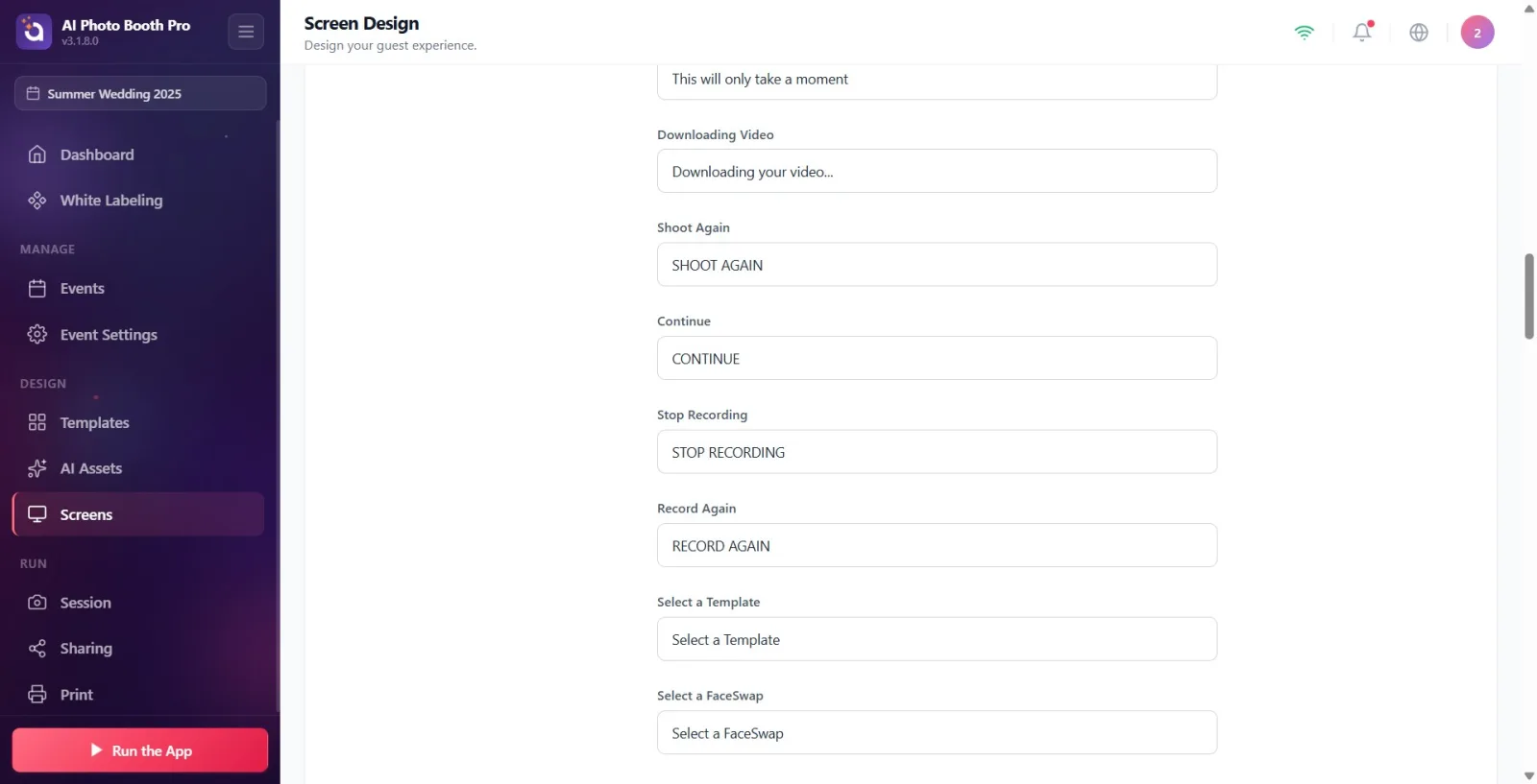
The Capture Screen section (description: Text shown during photo/video capture) contains all text visible during capture and processing. Fields: Processing Photo (default Processing your photo…), Processing Video (Processing your video…), Processing Subtitle (It will only take a moment), Downloading Video (Downloading your video…), Shoot Again (REDACT), Continue (CONTINUE), Stop Recording (STOP RECORDING), Record Again (RE-RECORD), Select a Template (Select Template), Select a FaceSwap (Select FaceSwap), Select a AI Effect (Select an AI Effect), Say Cheese (SMILE!).
🔎 Elements on the screen: Capture Screen chapter title; 12 text boxes: Process Photo, Process Video, Caption Process, Download Video, Retake, Resume, Stop Recording, Record Again, Select Template, Select FaceSwap, Select an AI Effect, Smile.
Step 9 · Edit Screen Share texts
Screen Design → Texts
The Sharing Screen section (description: 'Customize the labels that guests see when they share or print their photos.') contains all posts in the share/print stream. Fields: 'Print' (default PRINT), 'Print' (PRINT), 'Email' (EMAIL), 'SMS' (SMS), 'WhatsApp' (WHATSAPP), 'QR' (QR), 'Arrow' (DONE), 'Reuse' (REUSE), 'Painting · Cancel' (Cancel), 'Painting · Save' (Save), 'Phone Number Title' (Phone Number Title), 'Screens' (this field sets the 'scan and download' text with QR — default Scan and Download), 'Rendering' (PROCESSING…), 'Complete' (COMPLETE), 'View Media' (VIEW MEDIA), 'Offline' (Offline), 'Border Exceeded', 'Native Share', 'SEND'.
🔎 Elements on the screen: Sharing Screen chapter title; 19 text boxes (Print, Print, Email, SMS, WhatsApp, QR, Arrow, Reuse, Paint · Cancel, Paint · Save, Phone Number Title, Screens, Render, Complete, View Media, Offline, Limit Exceeded, Native Share, Send). Note: The field labeled Screen Design is actually the QR 'scan and download' text.
Step 10 · Edit Payment Screen texts
Screen Design → Texts
The Payment Screen section (description: Customize payment page texts) contains the text on the payment selection screen when using the paid booth. Fields: Payment Title (default Choose Your Entertainment), Payment Subtitle (Choose Your Experience), Pay Button Prefix (Let's Go – Pay), Free Proceed Button (Let's Go).
🔎 Elements on the screen: Payment Screen chapter title; 4 text boxes: Checkout Header, Checkout Subheader, Checkout Button Prefix, Free Pass Button.
Step 11 · Edit Payment QR Screen texts
Screen Design → Texts
The Payment QR Screen section (description: Customize payment QR page texts) contains the text on the screen showing the QR for the guest to pay by phone. Fields: QR Page Title (default Almost done!), QR Page Subtitle (Complete your payment to continue), QR Instruction (Scan QR code to complete payment).
🔎 Elements on the screen: Payment QR Screen chapter title; 3 text boxes: QR Page Title, QR Page Subtitle, QR Instruction.
Step 12 · Edit Payment Success Screen texts
Screen Design → Texts
The Payment Success Screen section (description: Customize payment success page texts) contains the texts displayed after payment confirmation. Fields: Success Title (default Everything is ready!), Success Subtitle (Payment successful! Let's make memories), Success Instruction (Your session will start shortly.).
🔎 Elements on the screen: Payment Success Screen chapter title; 3 text boxes: Achievement Title, Achievement Sub-Title, Achievement Instruction.
Step 13 · Edit page titles (Gallery / FaceSwap / AIEffect / Template)
Screen Design → Texts
Four separate sections set the header of the respective selection pages: Gallery Page → Gallery Title (default Gallery); FaceSwap Page → FaceSwap Title (Select a Photo) and FaceSwap Gallery Title (Select Face Swap Gallery); AIEffect Page → AIEffect Title (Select an AI Effect); Template Page → Template Title (Select Template).
🔎 Items on the screen: Gallery Page, FaceSwap Page, AIEffect Page, Template Page sections; title boxes: Gallery Title, FaceSwap Title, FaceSwap Gallery Title, AIEffect Title, Template Title.
Step 14 · Edit Payment Page (option) texts
Screen Design → Texts
The Payment Page section (description: Texts for payment page) contains titles and descriptions of digital download and print options. Fields: Digital Download Title (Digital Download by default), Digital Download Description (Go digital: instant download (no print)), Print Title (Print), Print Description (Take home: photo print).
🔎 Elements on the screen: Payment Page chapter title; 4 text boxes: Digital Download Title, Digital Download Description, Print Title, Print Description.
Changes are automatically saved (~0.5 sec after you stop typing) — there is no separate Save button.
The pale gray text (placeholder) in the box is the built-in default for that field; When he writes his own text, it takes its place. If you clear the space, the booth will show the default again.
Texts are activity specific: each activity keeps its own texts, any changes you make to one activity do not affect the other. An event must be selected for the change to be saved.
Client Language affects only the guest display (booth); It does not change the language of the operator/settings interface.
11 languages supported: English, Turkish, Deutsch, Français, Español, Italiano, Português, Română, Polski, Русский, Čeština.
When Customize Texts is off, all screens use the built-in default texts and editing sections are not visible.
The field labeled Screen Design in the Screen Sharing section actually sets the QR and 'scan and download' text (default is Scan to Download) — don't be fooled by the label name.
IMPORTANT: Changing Client LanguageAFTER you enter custom texts — changing the language OVERWRITES any custom text you enter with the new language defaults (removing your work). First choose the language, then customize the texts.
Writing text or turning on the switch when the event is not selected: changes are not saved, only the defaults appear. First create/select an event.
Forgetting to turn on the Customize Texts switch: editing sections are not visible and custom texts are not applied to the booth.
Thinking that when you clear a field and leave it empty, 'empty' text will appear in the booth: empty field is not deleting, it returns to default.
Mistaking Client Language for application/operator language: affects only the guest screen, does not change the Settings interface.
Thinking that it will disappear when you write the text and immediately leave the tab: automatic recording (500 ms) and the pending recording is preserved when the tab is changed; Still, it's safe to wait a second.
Related topics
Voices Screen Design