
Before this: How to Create an Event?
The flow for creating a photo template from scratch: from the Photo tab of the Templates page, the "Create New" button opens a 4-step wizard (Type → Size → Layout → Style); pressing "Create" takes you to the canvas editor; after you edit and exit, the template is saved automatically. Use this flow when you want to define a new print/digital output template.
- An event must be selected/active — templates are linked to the current event
- Access to the Templates page in the Settings interface
Step by step (summary flow)
Step 1 · Open the Templates page and switch to the Photo tab
Templates (/templates) → Photo tab
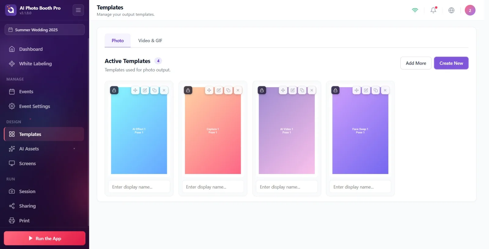
Open the Templates page from Settings. Make sure the Photo tab is selected among the two tabs at the top (the other is Video & GIF).
🔎 On-screen elements: Tabs: Photo / Video & GIF; heading: Active Templates; top right the Add More and Create New buttons
Step 2 · Press the Create New button
Templates → Photo tab
Press the purple Create New button at the top right (if there are no templates, the Create New button in the empty state does the same thing). The wizard modal opens at step 1; by default the Photo type and 4×6 size are preselected.
🔎 On-screen elements: Create New button (btn-purple, data-tour='template-create'); in the empty state No templates yet + Create New
Step 3 · Step 1 — Choose the template type (Photo)
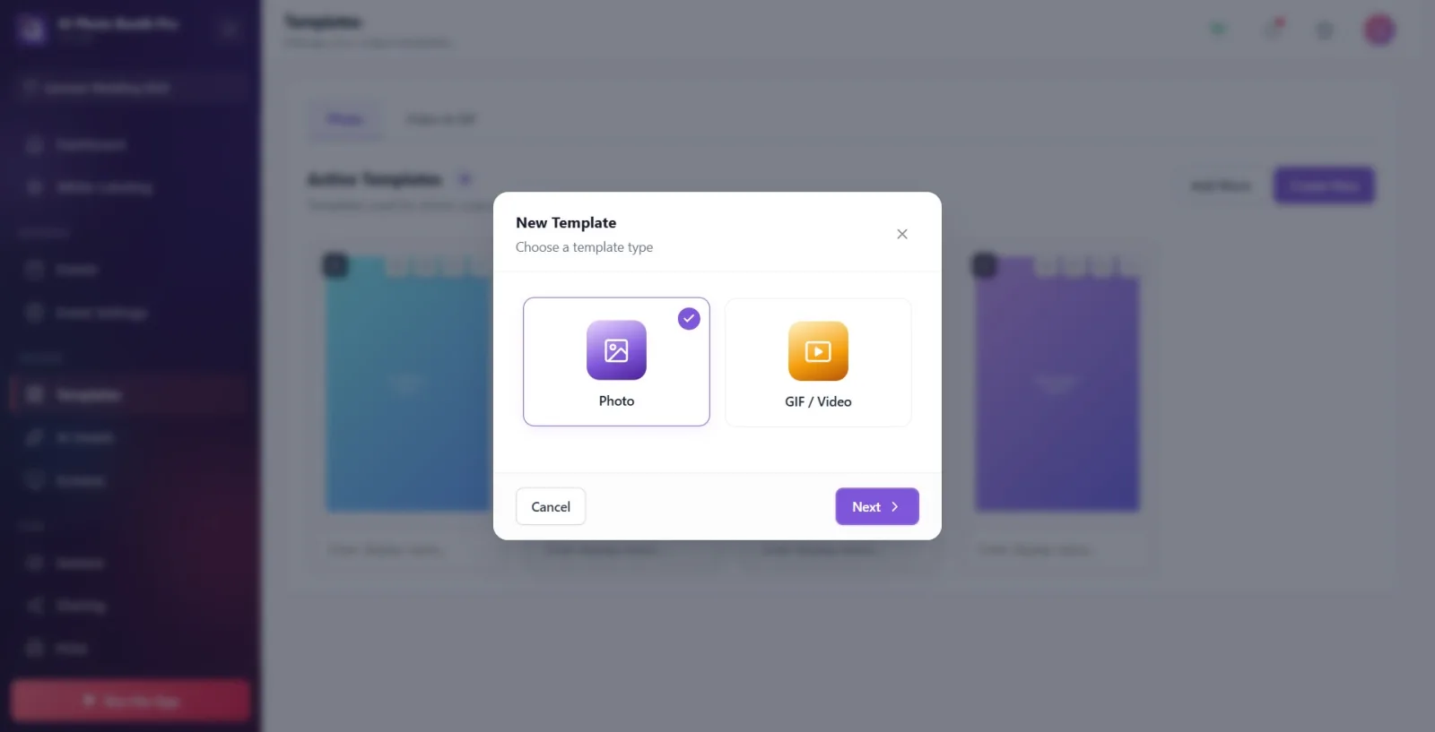
New Template wizard → Step 1: Choose a template type
Select the Photo card among the cards in the modal that opens (there is a GIF / Video card for video — for a photo template, stay on Photo). Once you select it, the card is checked. Press the 'Next' button in the bottom corner. This step is where the photo/video distinction is made.
🔎 On-screen elements: Modal title New Template + subtitle Choose a template type; cards: Photo, GIF / Video (VideoPrint card hidden); footer: Cancel / Next
Step 4 · Step 2 — Choose the output size (including vertical/horizontal)
Wizard → Step 2: Choose a size
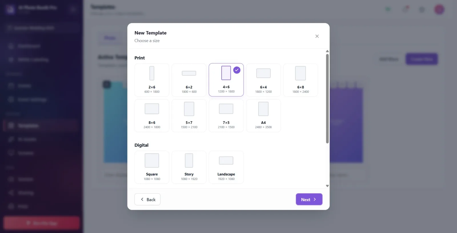
Select one of the size cards. Under the Print heading there are print sizes (2×6, 6×2, 4×6, 6×4, 6×8, 8×6, 5×7, 7×5, A4), under Digital there are Square/Story/Landscape, and under Custom there is your own dimension. The vertical/horizontal distinction is made here: e.g. 4×6 vertical, 6×4 horizontal; Story (1080×1920) vertical, Landscape (1920×1080) horizontal. If you choose Custom, fill in the Width (px) and Height (px) fields. If 2×6 or 6×2 is selected, a photo strip info box appears. Press Next.
🔎 On-screen elements: Section headings: Print / Digital / Custom; cards 2×6/6×2/4×6/6×4/6×8/8×6/5×7/7×5/A4, Square/Story/Landscape; for Custom Width (px) × Height (px); info box Photo Strip; footer Back/Next
Step 5 · Step 3 — Choose the layout and mode
Wizard → Step 3: Choose a layout
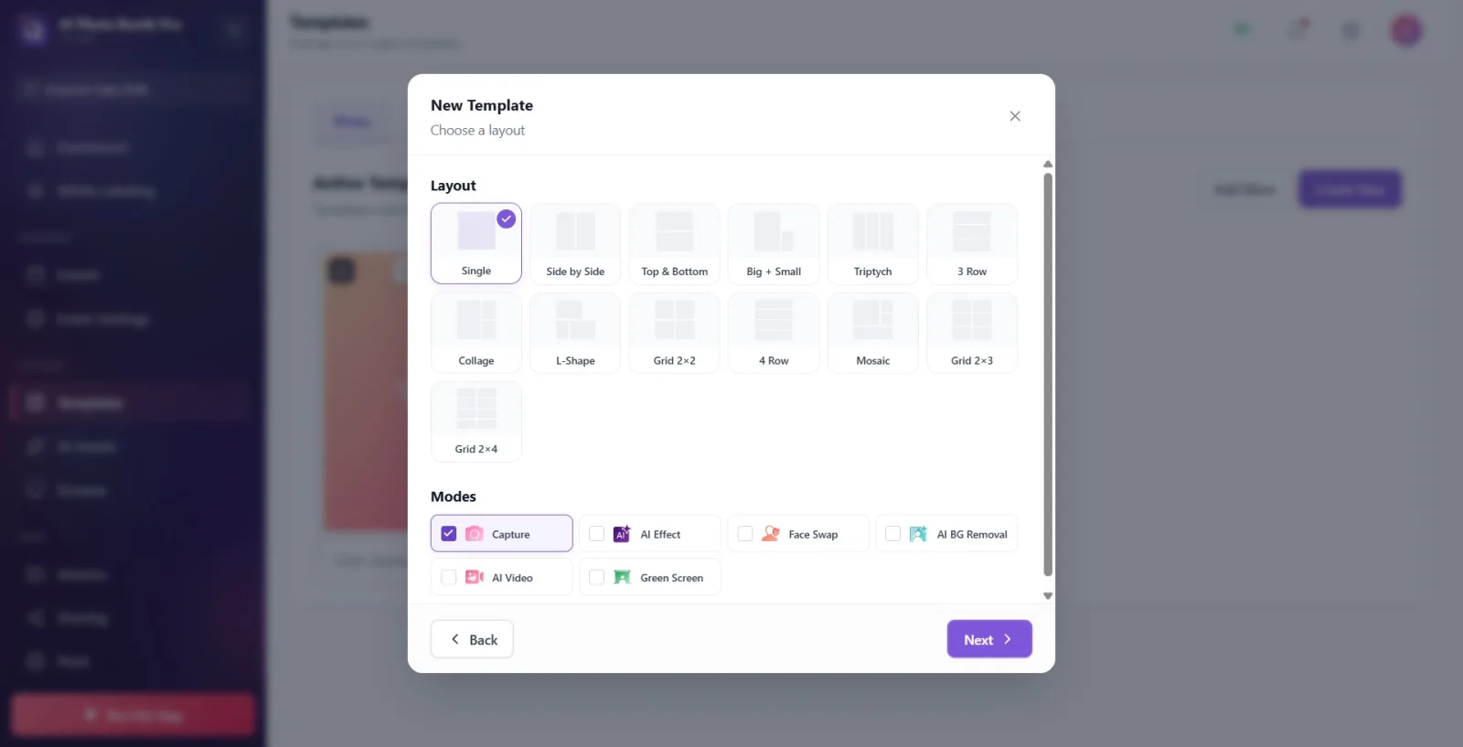
Under the Layout heading, choose the photo arrangement (Single, Side by Side, Top & Bottom, Big + Small, Triptych, Grid 2×2, Grid 2×3, Grid 2×4, etc. — each layout contains a certain number of photo slots). Then, under the Modes heading, choose the capture mode (Capture, AI Effect, Face Swap, AI BG Removal, AI Video, Green Screen — single selection, radio behavior). The selected mode determines how the photo slots in the layout are processed. Press Next.
🔎 On-screen elements: Headings: Layout and Modes; layout cards with SVG previews; mode cards with a colored dot + name (Capture selected by default); footer Back/Next
Step 6 · Step 4 — Set the name, color theme and options
Wizard → Step 4: Choose a style
In the Name field, type the template name (if left empty, it is automatically named '{Size} {Layout} Template'). Under Color Theme, choose a theme (None/Fun/Wedding/Neon/Pastel/Holiday/Corporate/Retro — the theme adds a border and background color). Under Options, turn on the QR Code and/or Logo switches (they are added to the footer area). When you are ready, press the Create button in the bottom corner.
🔎 On-screen elements: Name text box (placeholder My Template); Color Theme cards; Options toggle rows QR Code and Logo; footer Back / Create
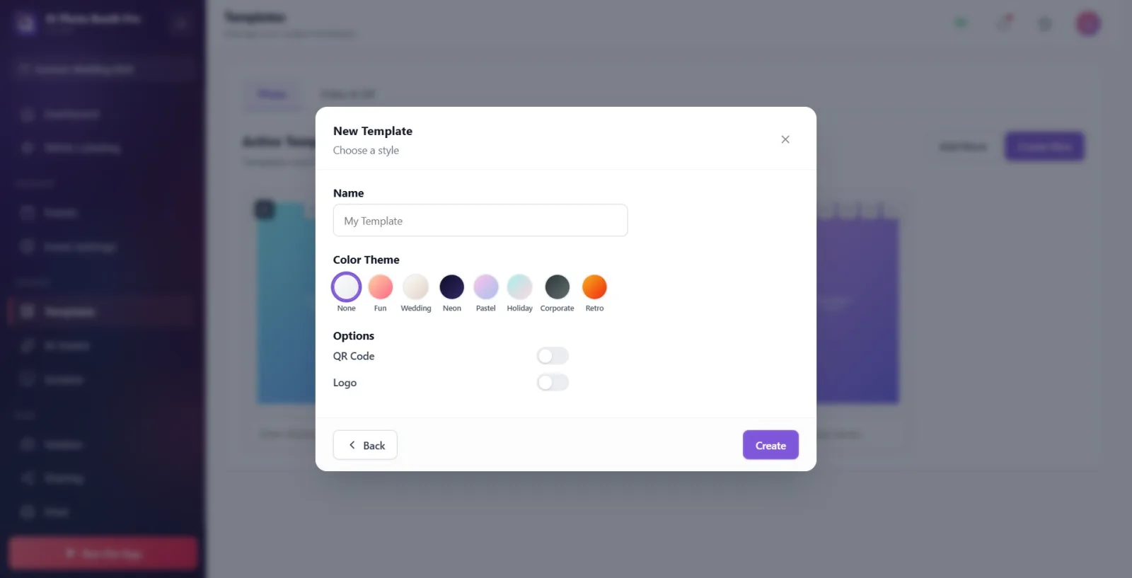
Step 7 · Press Create and go to the canvas editor
CreateAndEdit → /templateeditor (Canvas editor)
Press the Create button. Based on the selected size/layout/mode/theme, the app generates the initial layers and directs you to the canvas editor. (Note: If the same wizard combination was previously created and left untouched, instead of generating a new template it loads the existing one into the editor.)
🔎 On-screen elements: Create button (btn-purple-solid); then the canvas editor screen
Step 8 · Edit the template in the canvas editor
Canvas editor (TemplateEditorCanvas)
Edit the template as you like in the editor: add a new layer from the 'Add Layer' menu (photo/text/image/QR, etc.), drag and resize layers on the canvas, adjust settings from the Layers and Properties panels, set the canvas size/background and the print options ('2 Inch Cut', 'Combine with Another 2x6', Print Two Copies at Once), add a cover image if needed, and click the name to rename it.
🔎 On-screen elements: Add Layer button; Layers / Properties / Safe Zone panel buttons; Canvas size & Background; Printing section; Cover Image; top left Back to Templates
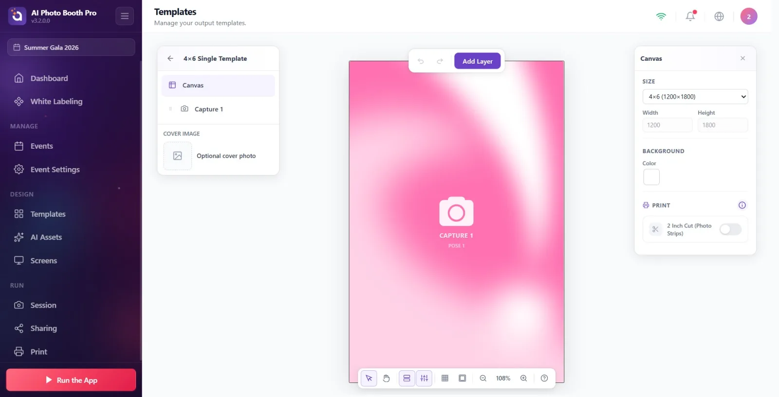
Step 9 · Save the template (automatic) and go back
Canvas editor → Templates
There is no separate Save button — changes are saved automatically (autosave). When you are done, press the Back to Templates button at the top left; exiting the editor triggers a final save that also includes the cover image, and the template is added to the Active Templates list on the Photo tab.
🔎 On-screen elements: Back to Templates button (te-panel-back / te-mobile-exit); the new template card on the Templates page
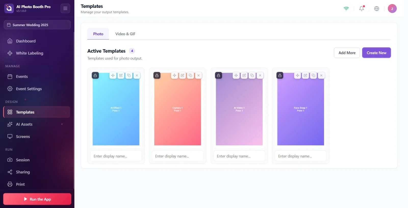
Canvas Editor — Layers, Background and Printing
The editor opens after the last step of the wizard. The template's real design is done here, with layers — the slot the captured photo goes into, the logo, text, frame and background image are all layers.
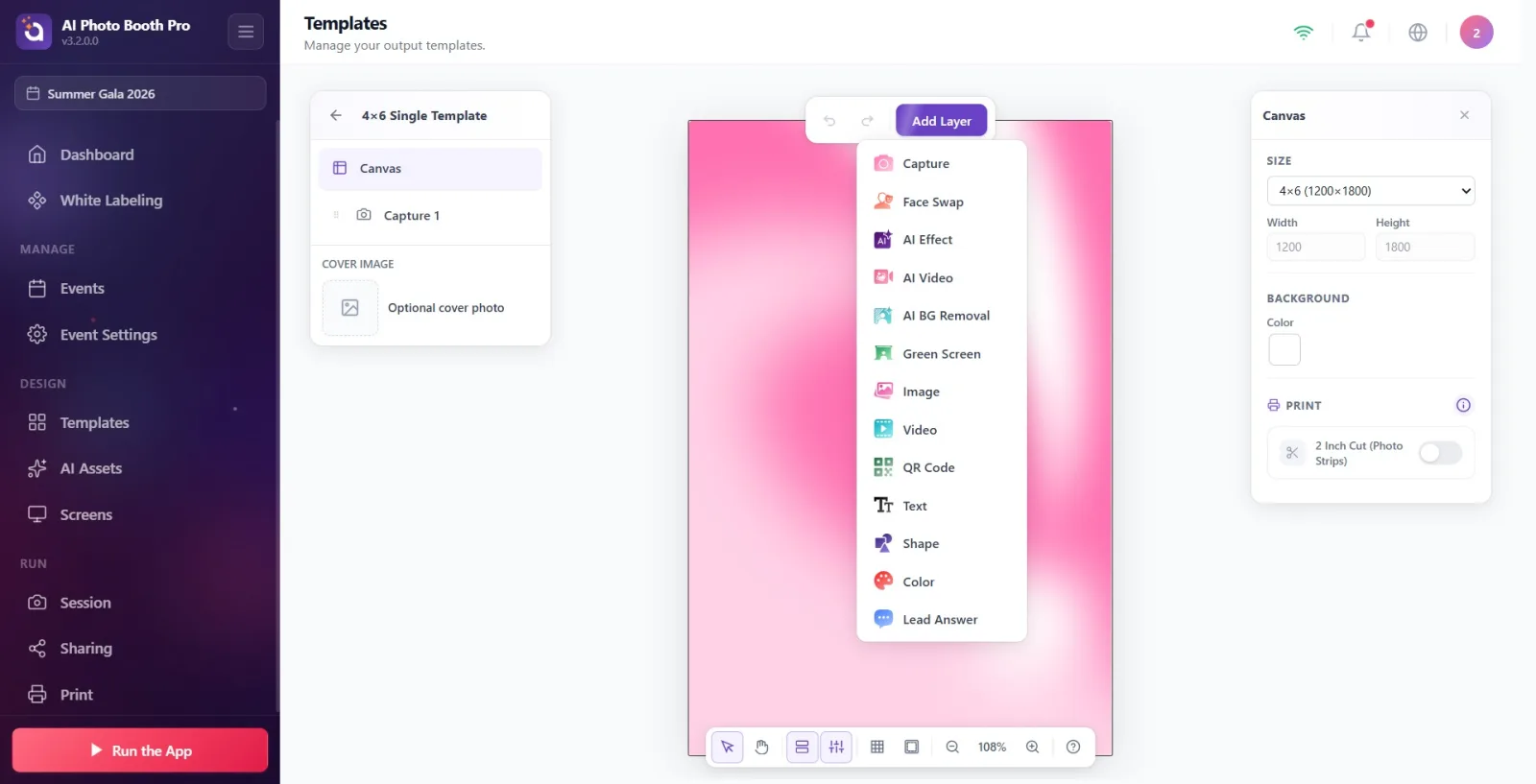
Layer types
In the editor, everything is made of layers. The types you can add:
- Capture — the slot the captured photo goes into. The heart of the photo template.
- Image — a static visual: logo, frame or background image.
- Text — text; font, size, color, alignment, bold/italic.
- Shape — rectangle, circle, triangle, star, hexagon, arrow…
- Color — a block with a solid color or gradient fill (for a colored background).
- QR Code — a QR code for the sharing link.
- Green Screen · AI Effect · AI Video · AI BG Removal · Face Swap — slots for AI/chroma results.
- Lead Answer — dynamic text that prints the form/survey answer.
The type names in the Add Layer menu appear in English (Capture, Image, Text…) — but after you select one, the titles in the Properties panel on the right are in Turkish (Capture, Image, Text…). If a type in the menu is dimmed with a “coming soon” badge, it can't be used with that template type.
How to add a layer
- Tap the purple Add Layer button in the top toolbar (on desktop, hovering over it also opens the menu).
- Choose a type from the menu that opens. The layer is created around X=50, Y=50, at the very top (frontmost z-order) and comes selected automatically.
- The Properties panel on the right opens for that layer; you edit it from there or with the handles on the canvas.
Adding a background image (Image layer)
There is no separate “background image” button in the editor. A background image = an Image layer that covers the whole canvas and is sent to the very bottom.
- Select Add Layer → Image.
- In the Image group on the right, tap the file-selection area → pick the image from the native file picker that opens (the Windows file dialog). (It is not an HTML file input.)
- Set the Fit dropdown to Cover — the image fills the box completely and the overflow is cropped (ideal for a background). Options: Contain / Cover / Stretch.
- Spread the layer across the whole canvas: in the Position & Size group set X=0, Y=0, W = canvas width, H = canvas height. (Or drag from the corner handles to the canvas edge.)
- Press the Move Down (⌘[) button in the Properties → Actions row until the image drops to the bottom of the other layers. In the left Layers panel, the bottommost row = the backmost layer.
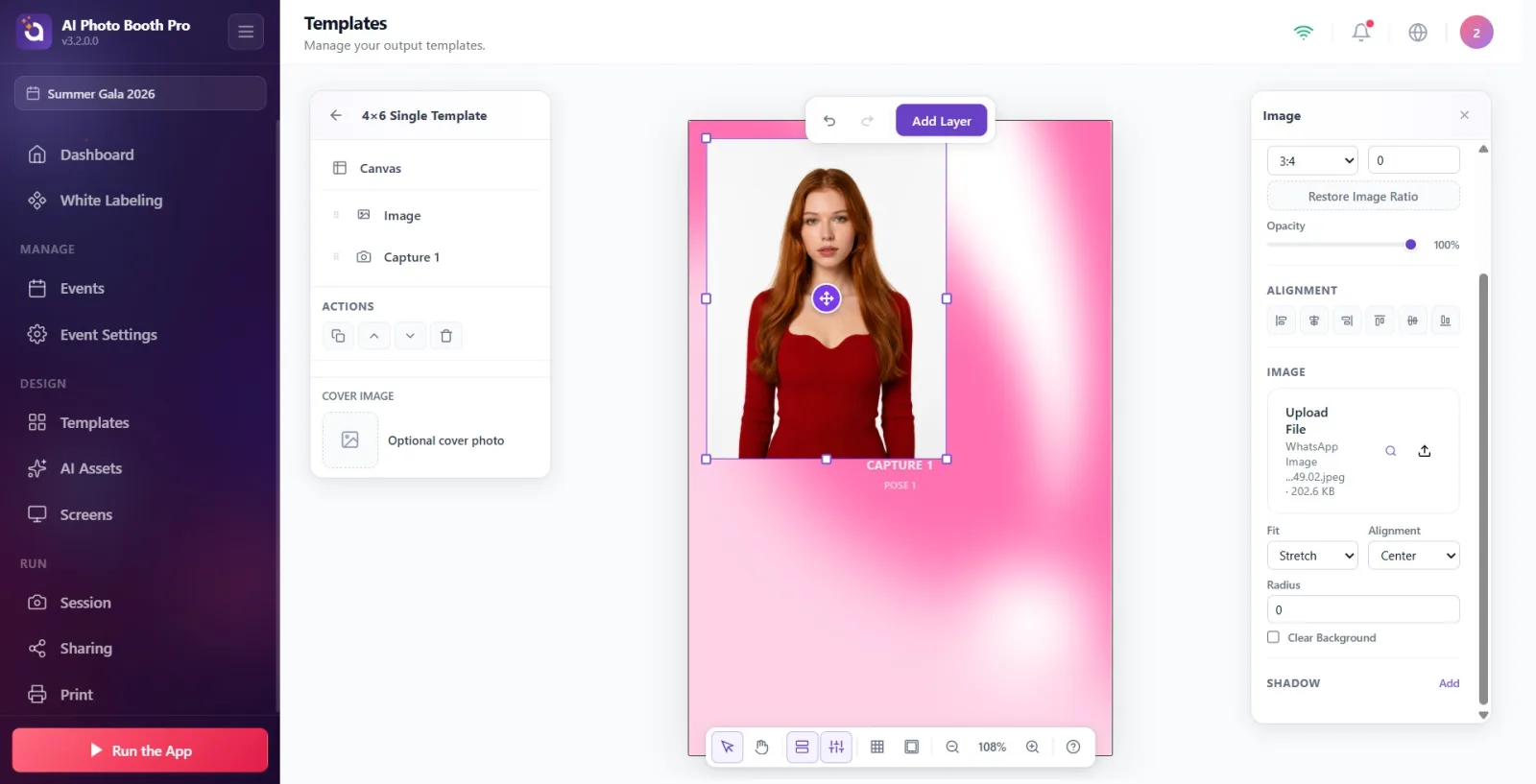
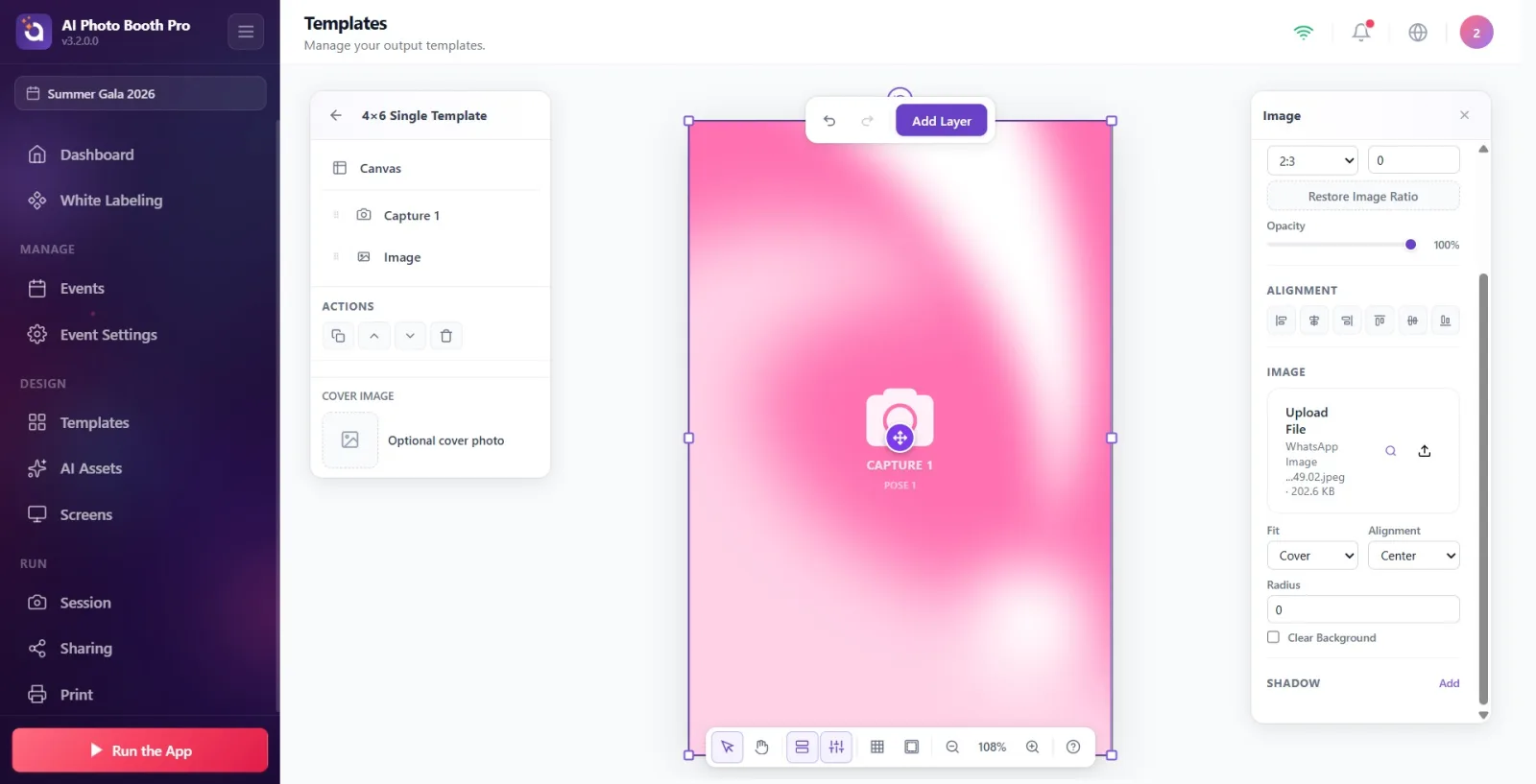
1) Canvas “Background” color: with no layer selected, Properties → Background → Color (solid or gradient). It is the base that can't be deleted.
2) “Color” layer: a movable color/gradient rectangle.
3) “Image” layer: a photo/image background (the steps above).
If you only want a color/gradient, (1) is enough; for an image background, use (3).
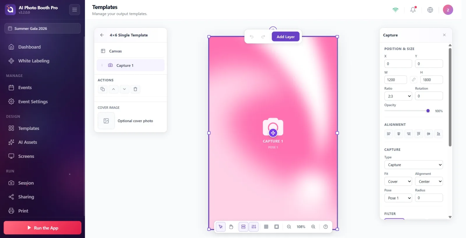
Layer properties panel
The right panel changes depending on the type of the selected layer. Common sections:
- Position & Size: X/Y, W/H, lock the aspect ratio, Ratio (3:2, 1:1…), Rotation, Opacity.
- Alignment: align left/right/top/bottom, center horizontally/vertically.
- Actions: Duplicate (⌘D), Move Up / Move Down, Delete.
- In the left Layers panel, each row has eye (visibility), lock and trash (delete) icons. Type-specific: font/size for Text, outline for Shape, foreground/background color for QR, and Shadow on every layer.
Saving and undo
- Saved automatically — there is no separate “Save”; once saved, a Saved badge appears at the bottom right.
- Undo (⌘Z) / Yinele (⇧⌘Z) are in the top toolbar.
- Exit: with the back arrow at the top left, Back to Templates → the template appears in the /templates list.
Printing and 2-inch cut
When no layer is selected (with the canvas selected), a Printing section appears in the Properties panel: 2 Inch Cut (Photo Strips), and for strip (2x6) templates also Combine with Another 2x6 and Print Two Copies at Once. For a detailed walkthrough: the “How to Enable 2 Inch Cut?” document.
Related document: iki-inc-cut