
Before this: What is Screen Design, How to Use General Tab?
The pause tab is where you design the waiting screen that will be displayed to guests when you pause the booth for a break (e.g. coffee break); This screen opens as an overlay on top of the Welcome/home screen. From here you set the waiting message, title, logo, item positions, a custom background (image or video), background opacity, and see it all in the live preview.
- An event must be created and selected — Display settings depend on the selected event; Changes on this tab are not saved when the event is not selected.
- The logo image, colors (Primary/Secondary), and default background must be set in the General (Main) tab — the pause screen inherits them from there.
step by step
Step 1 · Open Pause tab
Screens (Screen Design)
Open the Screen Design page from the left menu. The top tab strip has, from left to right, General, Welcome, Capture, Sharing, Pause, Animations, Texts, Voices tabs. Click the Pause tab, which is the fifth from the left.
🔎 On-screen elements: Top tab strip; Pause tab (5th row from left).
Step 2 · Open master key Pause Screen
Screen Design → Pause
Turn on the toggle switch in the Pause Screen section at the top. Description: 'Display a custom screen when your activity is paused. Perfect for coffee breaks.' If this switch is OFF, this special standby screen will not be shown even if you pause the booth. For all the design settings below to work, this switch must first be turned on.
🔎 Elements on the screen: section titled Pause Screen + on/off switch (SwitchSettingComponent).
Step 3 · Recognize live preview (Screen Preview)
Screen Design → Pause
The Screen Preview section shows a small live example of the waiting screen you designed; description: 'Live preview of the pause screen. Any changes you make below will be reflected instantly.' Any changes you make to the following fields (title, text, logo, location, background, opacity) will be instantly reflected here. If you click on the logo or text block in the preview, the page will automatically scroll to the relevant settings section. At the bottom right is the Reset to Defaults link and the Full Screen button.
🔎 Elements on the screen: Screen Preview canvas; clickable logo/content elements within; Reset to Defaults connection; Full Screen button.
Step 4 · Write the title (Pause Title)
Screen Design → Pause
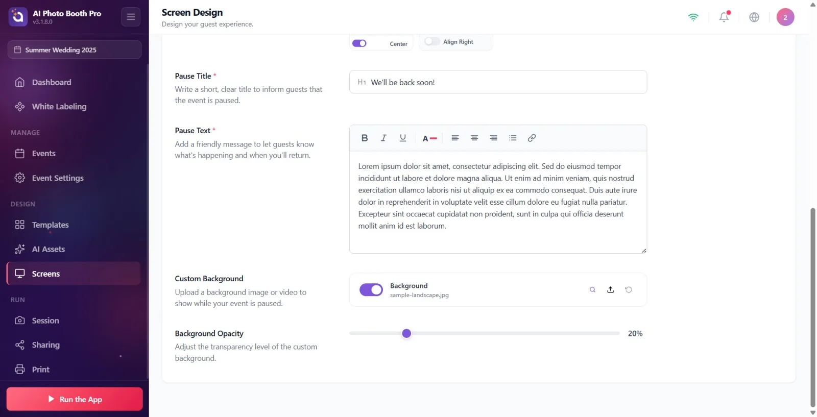
Enter a short and clear title in the Pause Title field. The field is a recommended field marked with an asterisk (*). Description: 'Write a short, clear title to let guests know the event is paused.' When the box is empty, the sample text (placeholder) is 'We'll be back soon!' visible. The title is shown in the preview with the Primary color in the 'General' tab.
🔎 Elements on the screen: Pause Title text box; placeholder We'll be back soon!; imperative sign (*).
Step 5 · Write the wait message (Pause Text)
Screen Design → Pause
Write a friendly message to guests in the Pause Text field. The field is marked with an asterisk (*). Description: 'Add a friendly message to let guests know what's going on and when you'll be back.' It's a rich text editor — you can apply formatting like bold/emphasis. While the box is empty, the placeholder reads 'We're taking a short 20-minute break. Thank you for your patience — we'll be back soon!' visible. The text is shown in Secondary color in the preview.
🔎 Elements on the screen: Pause Text rich text editor (RichTextEditor); placeholder 20 minute break text.
Step 6 · Position and align title + message block (Content)
Screen Design → Pause
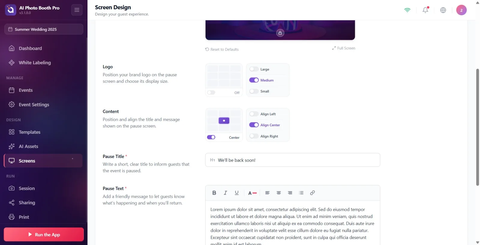
The Content section manages the header and message text together as a single block; described as: 'Position and align the title and message shown on the pause screen.' Select the block's on-screen location from the 3×3 location grid on the left (e.g. Center, Top). You can hide or show the entire content with the switch next to the grid (On / Off). Set the alignment of the text from the option on the right: Align Left / Align Center / Align Right. The content is open by default and sits in the middle.
🔎 Elements on the screen: 3×3 position grid (PositionGridComponent) + on/off switch next to it; alignment selector Align Left / Align Center / Align Right.
Step 7 · Position and size the logo (Logo)
Screen Design → Pause
The Logo section places your brand logo on the idle screen; description: 'Position your brand logo on the pause screen and choose the display size.' On the pause screen, the logo is OFF BY DEFAULT — when you turn on the switch next to the 3×3 grid, the logo appears top-center. Select its position from the grid, select its size from the right: Large / Medium / Small. Important: the logo IMAGE shown comes from the General tab; Only position and size are adjusted here. If the logo is not installed in the General tab, the default application icon appears in the preview.
🔎 On-screen elements: 3×3 position grid + on/off switch; size selector Large / Medium / Small.
Step 8 · Load custom background (Custom Background)
Screen Design → Pause
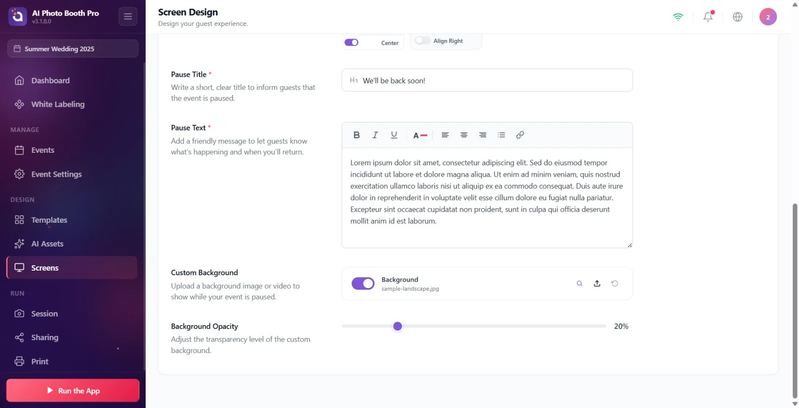
Load a background image or video on the idle screen from Custom Background; description: 'Upload a background image or video to show while your activity is paused.' The row has the 'Background' label, an on/off switch and three buttons on the right: upload (upload/ok), preview (magnifier or play) and restore (reset). When you press the upload button, the device's native file selector opens; Both images and videos are accepted (50 MB maximum). If you turn off the switch, the background will not be shown. If you do not upload your own file, the default background in the General tab (or the Welcome screen background / sample image) will be inherited.
🔎 Elements on the screen: FilePicker row: Background label, toggle switch, Load / Preview / Restore buttons; allowed types Image + Video, max. 50 MB.
Step 9 · Adjust background opacity (Background Opacity)
Screen Design → Pause
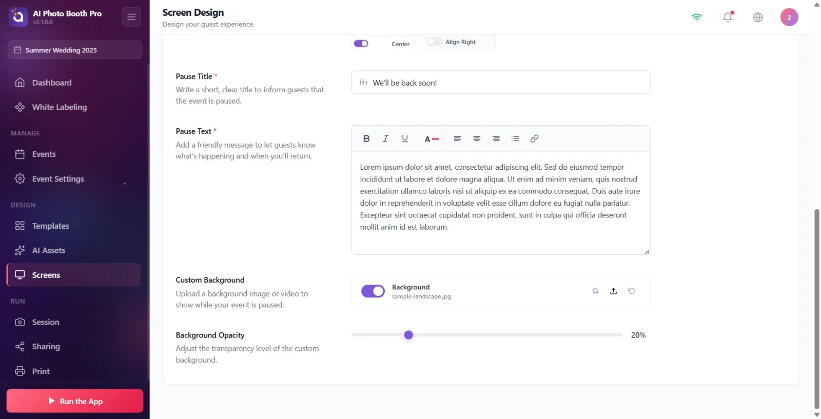
Adjust the transparency of the background from 0–100 with the Background Opacity slider; description: Adjust the transparency level of the custom background. The current percentage value (%) appears to the right of the slider. If there is no background, the slider remains inactive (dimmed) — add a background first with Step 8. The default value is 20%.
🔎 On-screen elements: Range slider (0–100) + percentage indicator; disabled (dimmed) when there is no background.
Step 10 · Preview in full screen, reset if necessary
Screen Design → Pause
Click the Full Screen button at the bottom right of the preview section to review the design in large size; Click the X or space in the corner to close it. If you want to reset all position/size/text/background settings, click on the Reset to Defaults link; The confirmation will say 'This action will reset all pause screen element positions and options to default values. This cannot be undone.' - Confirm with 'Reset' or cancel with 'Cancel'. Settings are saved automatically; There is no separate 'Save' button.
🔎 On-screen elements: Full Screen button and close full-screen preview (X); Reset to Defaults connection; confirmation window buttons Reset / Cancel.
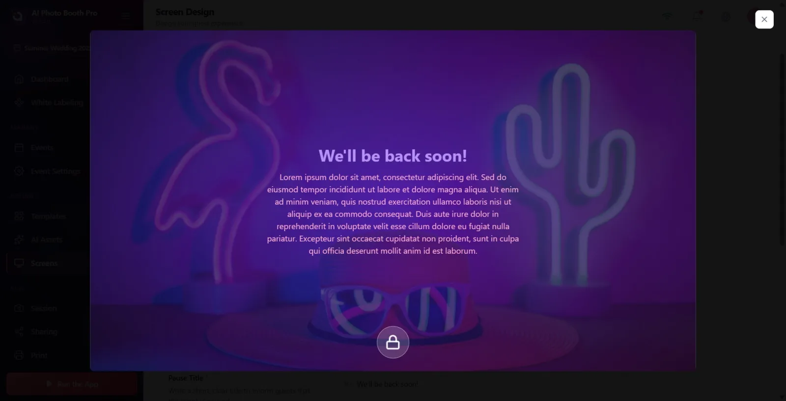
Settings are saved automatically: every change is saved immediately and reflected in the preview. You don't need to look for a separate Save button.
The logo IMAGE and title/text colors (Primary/Secondary) and preview background color are inherited from the General (Main) tab. To change them, go to the General tab; There are no color or logo-file settings in the pause tab.
If you don't install your own custom background, the system will fall back to the default background in the General tab, or else the Welcome (Welcome) screen background / sample image, respectively — so a backdrop may appear in the preview even if you don't install anything.
Video backgrounds play muted and loop automatically in the preview and booth.
The switch next to the 3×3 grid in sections Content and Logo hides/shows that element entirely (Off / On). If an item doesn't appear in the preview, check this key first.
The pause screen opens as an overlay on top of the Welcome/home screen; It allows you to provide a 'we'll be back soon' type of waiting message without disrupting the guest experience.
Forgetting to turn on the Pause Screen master switch: even if the booth is paused while it is closed, the custom standby screen does not appear at all and the whole design is wasted.
Being surprised by not seeing the logo: On the pause screen, the logo is OFF by default; You'll need to manually turn on the switch next to the grid in the Logo section.
Searching for logo image or colors in this tab: logo file and Primary/Secondary colors are set in the General (Main) tab; The pause tab only has position, size and alignment.
Complaining about the opacity slider not working when there is no background: the slider only activates when there is a background (your own installed or inherited).
Trying to upload a background file larger than 50 MB: the file is rejected; Use a smaller image or video.
Leaving title and message blank: both are required (*) fields; If left blank, that item will not appear at all in the preview.
Trying to set the round lock/dashboard icon that appears in the preview from this tab: that icon comes from the Welcome (Welcome) tab settings, it is not edited in the Pause tab.
Related topics
Welcome Screen General Display Settings (General Tab) Animations