


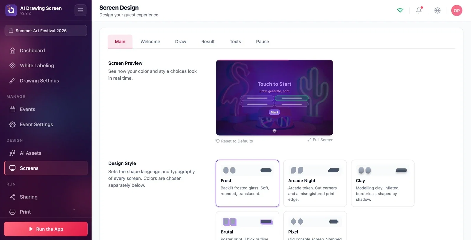
The Screens page (page title Screen Design) controls the look of every screen your guests see. It has six tabs: Main, Welcome, Draw, Result, Texts, and Pause. The Main tab sets the look shared by all screens: design style, colors, default logo and background, backgrounds for the other screens, and the dashboard icon for exiting the kiosk. The Screen Preview at the top shows every choice you make instantly.
This guide covers AI Drawing Screen 2.2.2. Available controls may vary by platform and version; platform-specific limitations are noted below.
- An event must be created and selected.
- If you plan to use a logo or background, have the files ready (JPG or PNG for the logo).
Step by step
Step 1 · Open the Screens → Main tab
Left menu → Screens → Main
Click Screens in the Design group of the left menu; the Main tab opens. The Screen Preview sits at the very top and stays visible as you scroll down. Reset to Defaults below the preview returns the settings on this tab to their starting values, and Full Screen shows the preview large.
Step 2 · Choose a Design Style
Screens → Main → Design Style
The design style sets the shape language and typeface of every screen; it is independent of the colors. There are five options:
- Frost (default): frosted glass — soft, rounded, translucent. - Arcade Night: arcade token — cut corners. - Clay: modeling clay — puffy, borderless. - Brutal: poster print — thick outline, hard shadow. - Pixel: old console screen — stepped edges.
Frost is a good starting point for a corporate event; Clay or Arcade Night for a fun one.
Step 3 · Set the UI Colors
Screens → Main → UI Colors
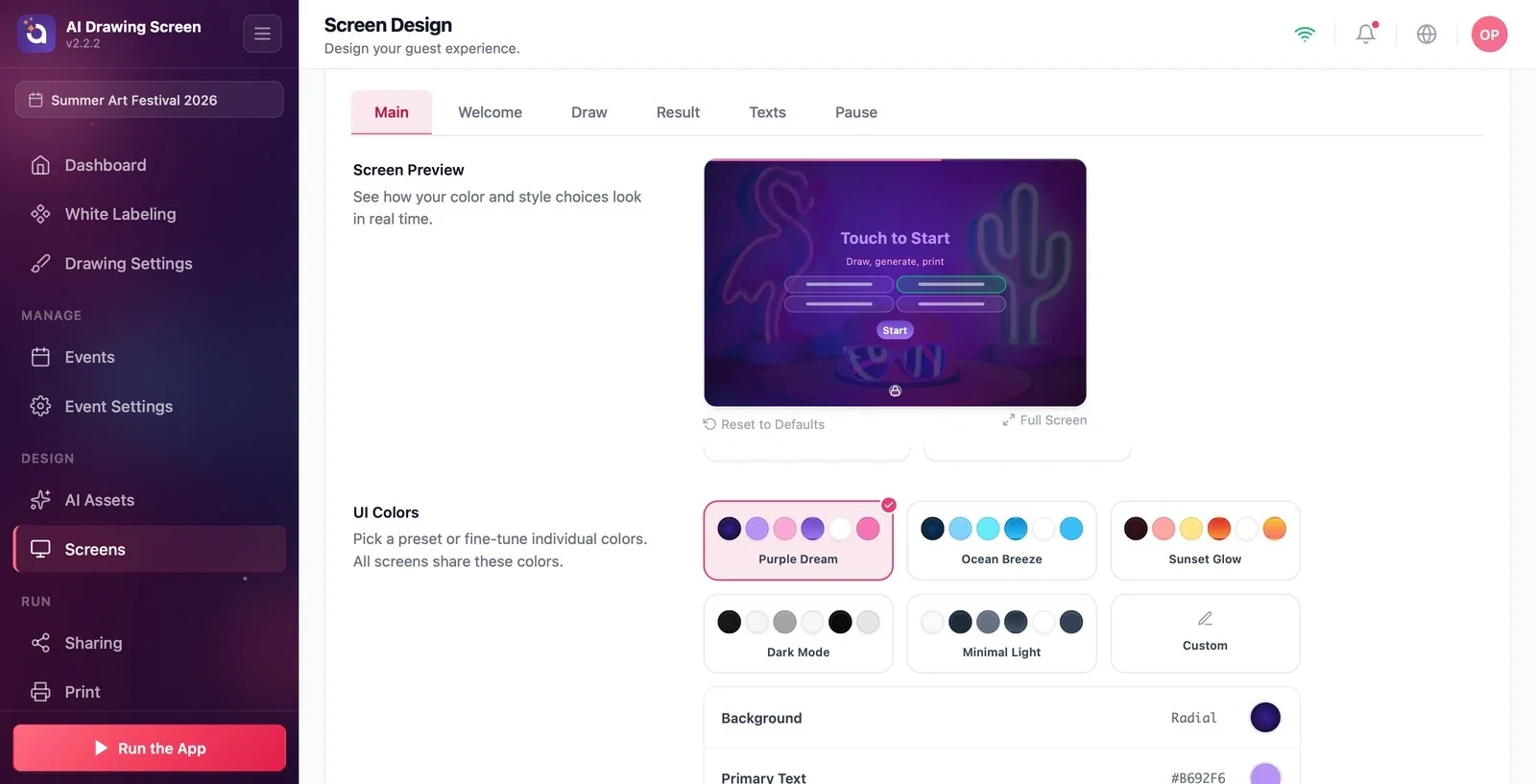
Pick one of the preset palettes: Purple Dream (default), Ocean Breeze, Sunset Glow, Dark Mode, Minimal Light. To change colors one by one, choose Custom; a row for each color opens below: Background, Primary Text, Secondary Text, Button BG, Button Text, Countdown, plus the drawing-screen-only Tool panel background, Tool panel text, and Canvas border. The background and button background can be a solid color or a gradient (Radial / Linear). All screens share these colors.
Step 4 · Default Logo and Default Background
Screens → Main → Default Logo / Default Background
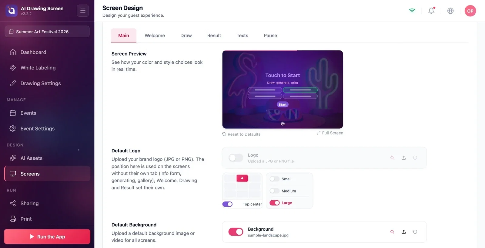
Upload your brand logo (JPG or PNG) to the Logo slot with Upload and turn its switch on. Choose where the logo goes from the position grid (default Top center) and its size from the options next to it (Small / Medium / Large). The position set here is used on screens that don't have their own tab (info form, generating, gallery); Welcome, Draw, and Result set the logo position on their own tabs, while the size is shared everywhere. Upload an image or video to the Default Background slot to use on all screens.
Step 5 · Backgrounds for Other screens
Screens → Main → Other screens
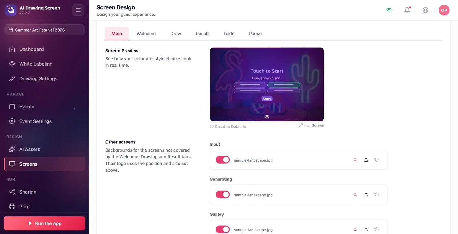
This is where you set the backgrounds of the screens other than Welcome, Draw, and Result: Input (the info form), Generating (the waiting screen shown while the AI artwork is being created), and Gallery. You can upload a separate image or video to each slot.
Step 6 · Dashboard Icon and Background Opacity
Screens → Main → Dashboard Icon
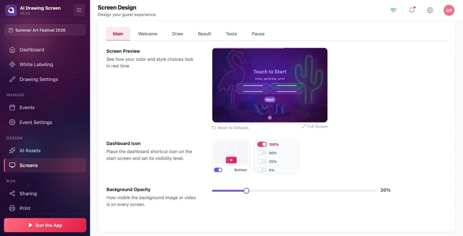
The dashboard icon lets you return from the start screen to the control panel while the kiosk is running. Choose its position from the position grid (default Bottom) and set its visibility with the options next to it:
- 100%, 50%, 25%: the icon is visible; a single tap opens it. - 0%: the icon is invisible, but a hidden area stays in the spot you chose; tap it 5 times in a row to open it. Choose this if you don't want guests to notice it.
If you turn the position off completely, nothing is left on the screen; you can then exit the kiosk only with the F11 or F12 key on a keyboard. If you have set a Dashboard PIN, it is asked for in every case. The Background Opacity slider at the bottom sets how visible the background image is on all screens (default 20%).
Choose the Design Style first, then the colors; the two are independent and appear together in the preview.
You can set the logo position separately for each screen; its size changes in one place, for all screens.
If you set the dashboard icon to 0% on a touch kiosk, tell your teammates the way out too (5 taps, in the corner you chose).
Turning off the dashboard icon position on a touch kiosk with no keyboard — exiting requires F11/F12; if there is no keyboard, don't turn it off, use 0% instead.
Setting the background opacity too high — a busy image makes the text hard to read.
Related topics
Welcome ScreenTextsKiosk SettingsRunning the App