
Templates control the printed/shared result; Screen Design controls the on-screen experience your guests see at the booth — the welcome screen, capture screen, sharing screen and pause screen, plus their animations, texts and voice prompts.
Two core controls used everywhere
Before diving into the tabs, get to know two controls you'll meet again and again throughout Screen Design — especially the first, which is the answer to "why isn't an element showing / how do I hide it":
- Position Grid (3×3) — both positions an element (logo, camera preview, button group, etc.) and turns it on/off. Selecting a cell in the grid places the element in that corner; setting the grid to off (no cell selected) hides the element. So the "show/hide" of most screen elements is done with this grid. (In fullscreen/fit modes, the grid becomes a locked On/Off toggle.)
- Option Picker — a segmented control for size / shape / alignment / fill; often paired with a section toggle (like "Show Labels" or "Descriptions").
Screen Design changes how the booth looks and sounds to guests. What the booth does (countdown length, video duration, capture modes) is set in Session Settings. Look here, behavior there.
Eight tabs, what each does
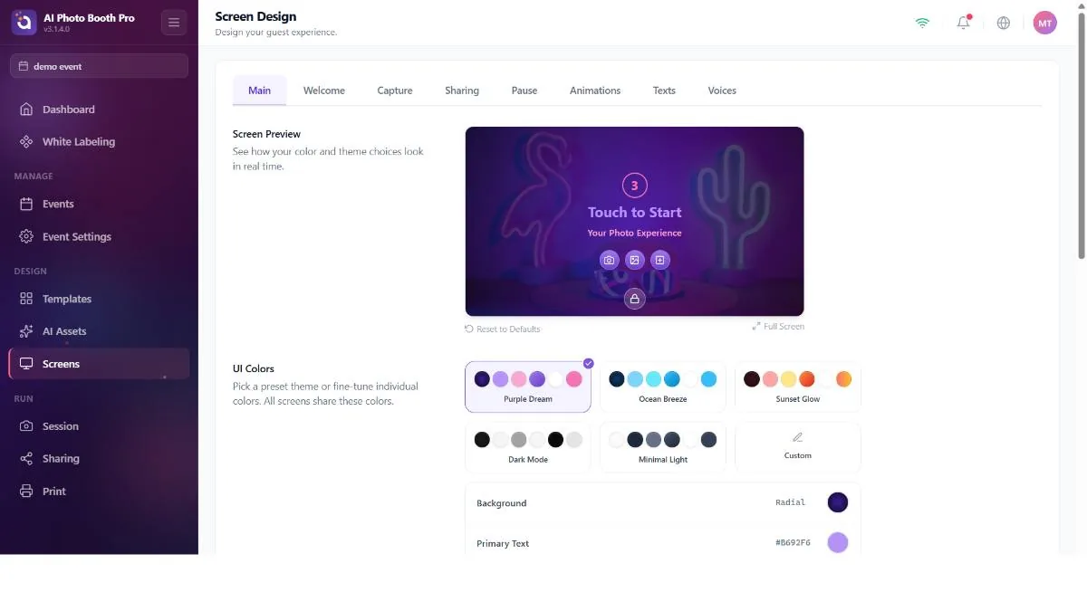
Main — global branding
Settings shared by all booth screens: a live preview + "Reset to Defaults," UI colors (6 ready-made themes — Purple Dream / Ocean Breeze / Sunset Glow / Dark Mode / Minimal Light / Custom — plus background, primary/secondary text, button background, button text and countdown color), Default Logo (a global logo that spreads to every screen), Default Background (a default background image/video for all screens), per-screen custom backgrounds (a separate image for the AI Effect / Face Swap / Gallery / Template / Payment / Lead-form screens) and background opacity.
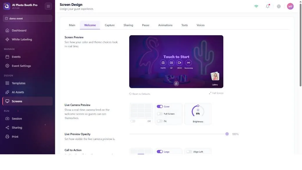
Welcome — the attract screen
The screen the guest sees before starting: a live camera preview (position + Cover/Fullscreen/Fit + brightness), the "Touch to Start" call-to-action (position/size/alignment + custom text), the session buttons (Photo/GIF/Video/Boomerang mode buttons — position, Circle/Square shape, label on/off, style), the gallery entry, the logo and a custom background.
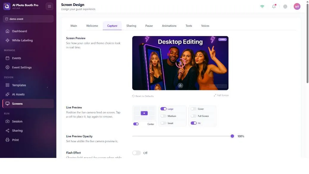
Capture — the capture screen
The screen shown while a photo is being taken: the live preview (position/size/fill), the Flash Effect (edge light) — with thickness and color temperature (this is the same setting as the flash on the Camera tab; changing one changes the other), the countdown ring, the photo thumbnails, the logo and the Cancel button (show/hide via the position grid).
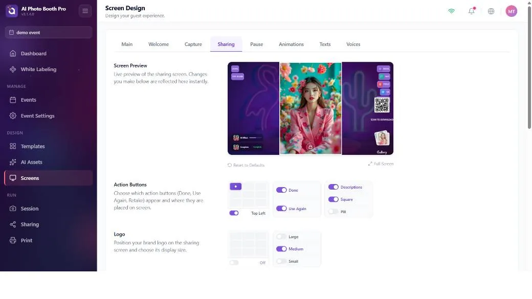
Sharing — the result/sharing screen
The screen where the guest gets their result: show/hide toggles for the Done and Use Again buttons, the position/size of the result photo, the position and labels of the sharing options set (Email/SMS/Print/QR/Share), the gallery, the inline QR position, the Enable QR Code and Share master switches, a progress bar and a custom background.
The Sharing tab sets the buttons' place and label; but which button appears (Print, Email, SMS) is determined by other settings. For the Print button, see the next box; for Email/SMS, you need to turn on the relevant Sharing setting.
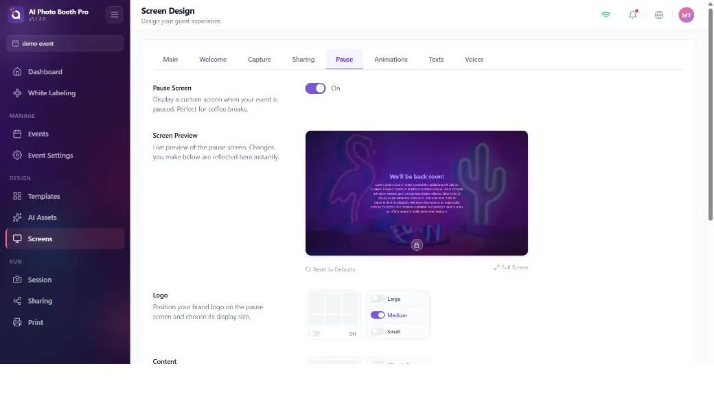
Pause — the pause/holding screen
An Enable Pause Screen master switch (turns the whole pause screen on/off), a logo, the position of a content block (title + rich-text body), and a custom background.
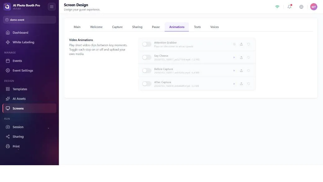
Animations — transition videos
Four steps, each a file picker + on/off: Attention Grabber, Say Cheese, Before Capture and After Capture.
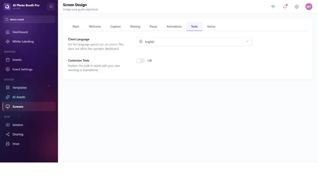
Texts — screen texts
The guest-facing language (Client Language, 11 languages) and a Customize Texts master switch; when on, you can individually change the wording of every text on the Welcome/Capture/Sharing/Payment/Gallery/FaceSwap/AI Effect/Template screens (e.g. the Print, Email, QR, Done, Use Again button texts). Note: changes here only change the text, not whether the button appears.
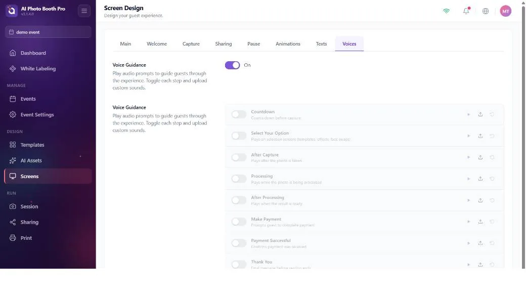
Voices — voice prompts
A Voice Guidance master switch and a sound-file picker for 8 steps (countdown, effect selection, after capture, processing, payment, thank you, etc.).
"Why isn't my Print button showing?" — the most frequent question
Operators get stuck on this most: "I turned the Pause button on here but I don't have a Print button." The reason: the Pause screen has a direct on/off switch in Screen Design → Pause tab; but the Print button has no switch anywhere in Screen Design. The Print button appears on the guest screen only when three conditions are met at once:
- The result must be printable — there has to be a printable output. In pure video (Video 360 / Glambot / video-only) modes there's nothing to print, so the button doesn't appear.
- The printer must be enabled (Enable Print Button) — this setting is in Print Settings, not in Screen Design.
- The print limit must not be exceeded — if the event/session print limit is reached, the button disappears (or, if the printer is offline, the button stays with an "OFFLINE / LIMIT EXCEEDED" error).
Enable Print Button is set once based on the types you chose at event creation: if there's photo/GIF/boomerang it comes on, if it's pure video it comes off. Changing the capture modes afterward does not automatically turn it back on. If you created an event as a video type, or the printer somehow stayed off, the Print button won't appear and there's nowhere in Screen Design to turn it on — you have to go to Print Settings and turn on Enable Print Button.
The same logic applies to the others: the Email button appears only when Email sharing is on, the SMS button only when SMS is on, and the QR button only when Enable QR is on and the event is not Offline. In Offline mode all online sharing options are hidden — only Print works (it prints offline too).
How the screen flow (order) is determined
Screen Design doesn't set the order of the screens — there's no configurable "screen router." The sequence of screens the guest sees is derived from your event configuration: capture modes (Photo/GIF/Video/Boomerang), booth mode (Classic/Video360/Glambot) and Auto-Trigger, flow type (single/multi), event mode (Online/Offline) and the active feature screens (AI Effect, Face Swap, Template selection, Payment, Lead form, Gallery). Screen Design only styles the screens this flow produces; it doesn't route them.