
After you log in you land in the admin panel — the layout that wraps every configuration screen. Learn its three fixed parts (the sidebar, the header and the "Run the App" button) and you'll navigate the whole product with ease.
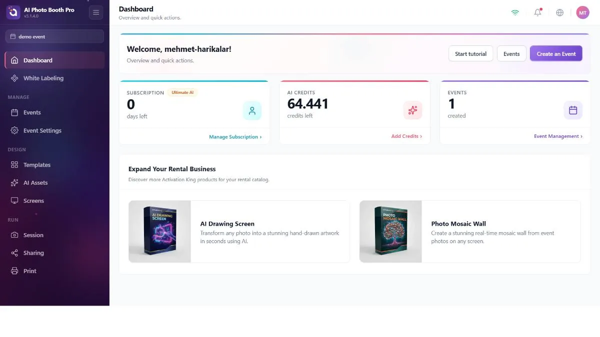
The sidebar
Along the left edge: the brand logo (tap to jump to the Dashboard), a collapse/expand button, the selected-event chip that tells you which event you're configuring, the grouped navigation menu and — at the bottom — a trial card, an update card and the big Run the App button.
The menu is split into the groups this guide follows:
- Manage
- Events, Event Settings
- Design
- Templates, AI Assets, Screens
- Run
- Session, Sharing, Printing
- Ungrouped (at the top)
- Dashboard, White Label
Before you select an event, you only see Dashboard, White Label and Events. Selecting or creating an event reveals Event Settings, Templates, AI Assets, Screens, Session, Sharing and Printing. (The Glambot item appears only when the event's booth mode is Glambot.) An empty group is hidden entirely; that's why the menu grows and shrinks as your setup changes. If you don't have any events yet, go to Events in the sidebar (or use the Create Event button on the Dashboard) and create your first event — the rest of the menu opens up at that moment.
If you already have events and none is selected, the app auto-selects the first one so the menu isn't empty. But if you're logging in for the first time and have no events, there's nothing to select, so the menu stays minimal — you have to create an event first. Each item is also limited by your license; features your plan doesn't include won't appear even with an event selected.
The header
Four persistent controls at the top right:
- WiFi indicator — shows whether the booth is online. Many features (AI, sharing, cloud sync) require a connection.
- Notification bell — a dropdown list of messages from the server; it refreshes every time you open the admin panel, and a dot marks unread items.
- Language globe — the same 11-language picker as on the login screen, changeable at any time.
- User avatar — your initials; tap to open the account menu (next heading).
Launching the booth — "Run the App"
Once everything is configured, the Run the App button (at the bottom of the sidebar) exits the admin panel and starts the guest-facing experience. It offers three ways to run:
- Run as Photo Booth
- The full capture experience your guests use.
- Run as Sharing Screen
- A station dedicated only to sharing results that have already been captured (QR / gallery).
- Show Pause Screen
- A holding screen for breaks, without ending the event.
Run the App is disabled until an event is selected — the selected-event chip in the sidebar is your cue. What happens inside these modes is the live capture flow, and it's outside the scope of this guide.